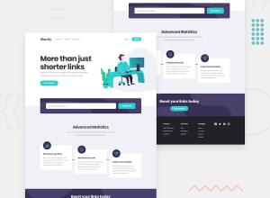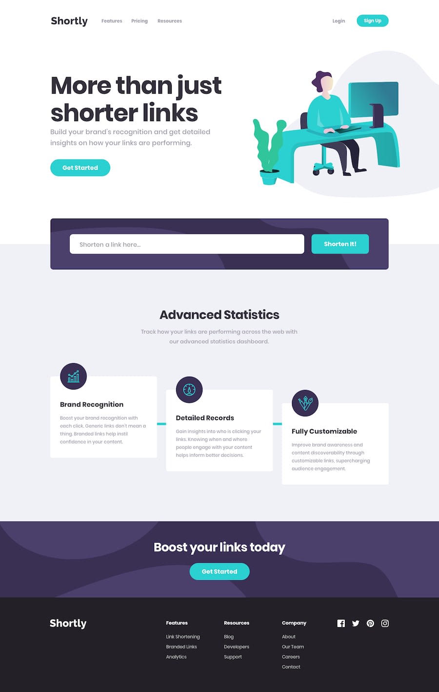
URL-shortening-API-landing-page with Everything covered in vanilla.
Design comparison
Solution retrospective
No questions, of course any criticism?
Community feedback
- @carlwickerPosted almost 3 years ago
Hey ya manik, good job on the layout. There are a couple of issues...
- links aren't saved to local storage, shortened links disappear on page refresh.
- mobile copy button has no left/right padding.
- consider doing the input validation check on every change rather than submit.
- fix html and accessibility issues in the report.
Keep up the great work.
0@Manik2375Posted almost 3 years ago@carlwicker Thanks for these! Really appreciate!
I'd like to clarify some :P
- Well that's because, don't know much about that currently, will do later for sure.
- Didn't notice, Fixed ^^
- Yes, that could be a nice addition. But I think I could only check if there is a
.or not? Because currently I am using api check itself, and well api even accept links likefrontendmentor.io, yes, no https,www. That's why I thought of using the api check itself, still I really appreciate this. - For real projects, that would be really important :thumbsup:
Still thank you so much! I really love criticism because it persuade us to see things in some other way.
Till next challenge, bbye ;)
0 - @Manik2375Posted almost 3 years ago
About issues, well I have to take a11y course for it. And about buttons one, didn't wanted to use js + for section one, headings aren't the direct child so..
Ik design isn't much same, in terms of elements size, that's because this challenge was done just for own practice, nothing special. :P
0
Please log in to post a comment
Log in with GitHubJoin our Discord community
Join thousands of Frontend Mentor community members taking the challenges, sharing resources, helping each other, and chatting about all things front-end!
Join our Discord
