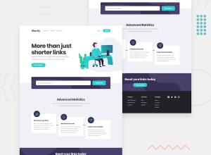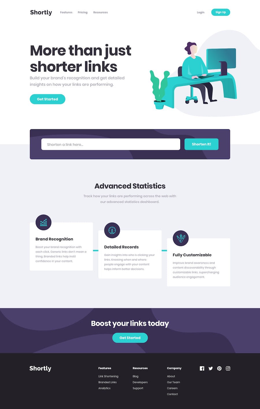
Design comparison
SolutionDesign
Solution retrospective
API Url shorting landing page using css, html and js.
Community feedback
- @asbhogalPosted over 1 year ago
Hi there,
Good attempt, however there are several things wrong with this solution:
- I can't see any logic incorporated for the API call, input validation etc. Do you have the script configured? I couldn't see it in the source files
- There are horizontal overflow issues with the hero image and navbar with viewport changes
- There are significant discrepancies in the solution compared to the mockup in terms of design (missing background images, missing styling in the Advanced Statistics section, missing background colors etc.)
- There is also a typo in the hero content - "then" instead of "than"
- The footer content is also missing
If this is difficult, I suggest maybe doing a more junior challenge to start with, then build your way up to this, as this is an advanced task for a beginner to front end development.
Hope this helps!
1@miraa123123Posted over 1 year agoThanks for the feedback, Im new to web dev ik some things are missing i will fix them when i get better in the future. @asbhogal
1@asbhogalPosted over 1 year ago@miraa123123 no problem, I understand. Take your time, this is a difficult challenge but you'll get there.
0
Please log in to post a comment
Log in with GitHubJoin our Discord community
Join thousands of Frontend Mentor community members taking the challenges, sharing resources, helping each other, and chatting about all things front-end!
Join our Discord
