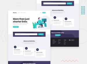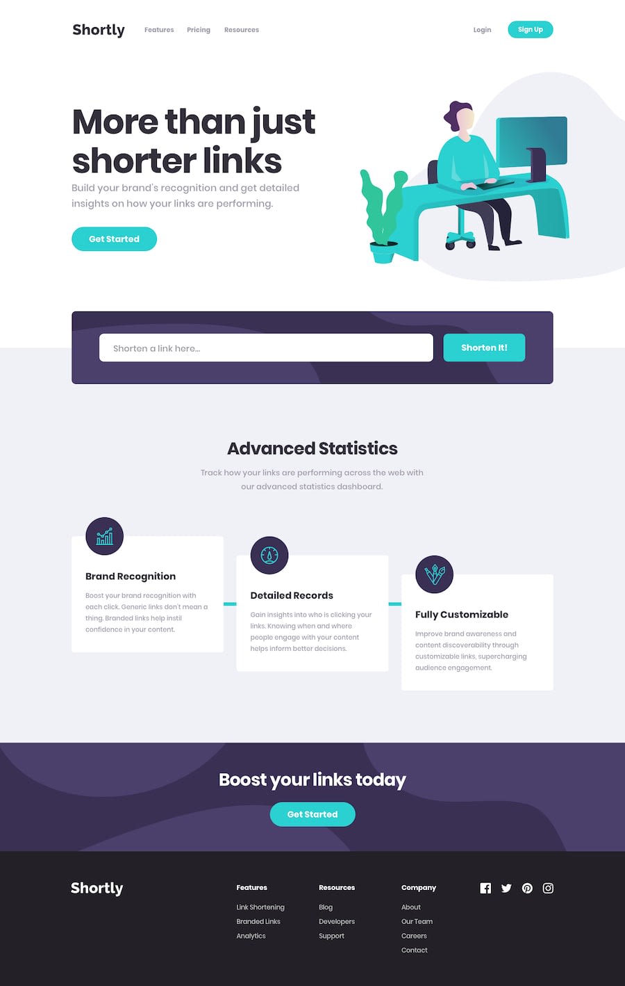
Design comparison
Solution retrospective
I should have followed mobile first approach
Community feedback
- @ahhmedsafwatPosted about 1 year ago
what did you use to make the login page ?
0@ahhmedsafwatPosted about 1 year agoHey, I tried shortening a link, but it didn't work. Also, it seems like you forgot to add a transition effect to the links with opacity. check it up? @Official-Nakul
0@Official-NakulPosted about 1 year agoi tried 2 apis but they are not working... and transition effect where? if you know any api please let me know @ahhmedsafwat
0@ahhmedsafwatPosted about 1 year agoyes i tried the given API it didn't work it kept giving me a CORB problem so I changed it to this API (https://is.gd/apishorteningreference.php) its really simple to use it @Official-Nakul
0@Official-NakulPosted about 1 year agosure thanks, and about which opacity and transition you are talking about@ahhmedsafwat
0@ahhmedsafwatPosted about 1 year agothe get started and sign in buttons you didn't use transition on them @Official-Nakul
0
Please log in to post a comment
Log in with GitHubJoin our Discord community
Join thousands of Frontend Mentor community members taking the challenges, sharing resources, helping each other, and chatting about all things front-end!
Join our Discord
