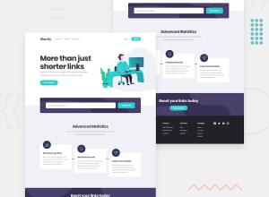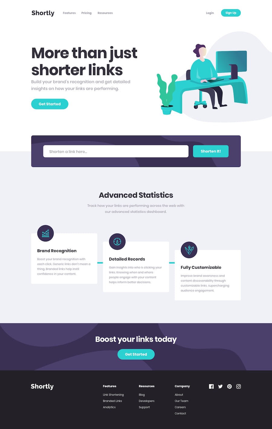
Design comparison
Solution retrospective
Hello friends!
I prefer to put my own twist on the things I create, hence why it looks slightly different.
I was recently at a interview for a jr. position and was asked if I had a specific project I wanted to showcase. This question caught me off guard, so I told them to look at my last project which I told them I created in 3-4 days in a completely new framework. This project had several buttons with no functionality. I noticed that when they looked at what I had created, they clicked on every button. In my eyes, having buttons that doesn't do anything takes away from the actual functionality of the app and makes it look amateurish. This is why you don't see a Nav, Sign-up button and more. I advice you to do the same if you're applying for a job.
Community feedback
Please log in to post a comment
Log in with GitHubJoin our Discord community
Join thousands of Frontend Mentor community members taking the challenges, sharing resources, helping each other, and chatting about all things front-end!
Join our Discord
