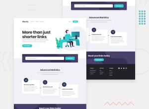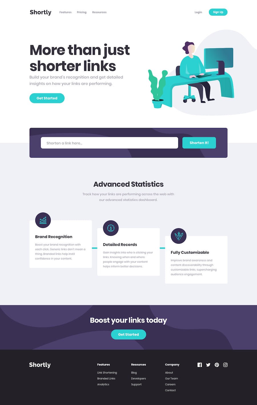
Design comparison
Solution retrospective
Hi everyone!
The instructions for this project call for using the rel.ink API, but that has been taken down by its creator, so I used the bit.ly API instead.
I would like feedback on the navbar and footer code specifically. I had a hard time with making those layouts.
Most importantly, I would like to know how others approach designing layouts like these.
Thanks for reading :)
Community feedback
- @duaimeiPosted about 4 years ago
I just started reviewing your code, I don't think that your validation is working like you would like.
You also shouldn't be storing your bit.ly token in plain text right in the file like that. You could one of the following:
- make a .env file that is git ignored, and then pushed onto whatever server you're running
- use github secrets
- figure out how to store secrets with whatever tool you use for deploying your webpage
As for the feedback you actually asked for: the header and footer look fine to me, but advanced statistics' cards don't look intentional enough to be steps. It gives off the impression that you weren't able to align the cards. It might be helpful to make the teal line be diagonal, or to be stepped.
4
Please log in to post a comment
Log in with GitHubJoin our Discord community
Join thousands of Frontend Mentor community members taking the challenges, sharing resources, helping each other, and chatting about all things front-end!
Join our Discord
