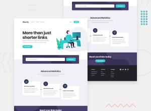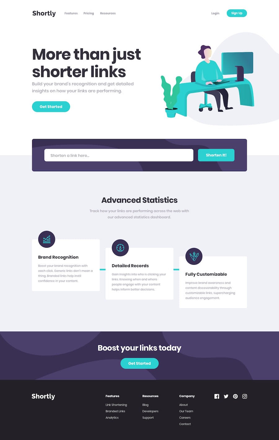
URL Shortening | React JS | Fetch API | Sass | Copy Functionality
Design comparison
Solution retrospective
I know there're lots of optimizations yet to be made to my project. Please have a look and help make it better like a pro!
Community feedback
- @DiarrahPosted over 4 years ago
Your code is so good! Love the trick how you mapped the cards in the stats section. Also love your hover effect on the buttons + the mobile nav deploy.
I have on thing I don't understand though which is the cta-box mixin. Could you explain that if you have time? Thank you!
2@sapinder-palPosted over 4 years ago@Diarrah Actually I've named every
aandbuttonthat has a box-shaped background, as cta-box. Because English isn't my first language, I couldn't come up with a better name. :)Edit- I guess I misinterpreted your question! Could you let me know what you don't understand about cta-box mixin?
0@DiarrahPosted over 4 years ago@sapinder-pal your English is amazing, never apologize for that! I understand the code now that I've done a little Googling and looking at the code more deeply. I've never seen the SCSS map function so I was really confused about what you were doing. I get it now so thank you! I'll definitely be using that technique in future projects.
0@sapinder-palPosted over 4 years agoI'm still working on this project because frontendmentor can't preview my webpage if the 'third-party cookies' ain't allowed by the user. I guess I'd fix it!
0@sapinder-palPosted over 4 years ago@Diarrah I've added the above-mentioned fix, and also I've made several changes to my project. Do check it out on github.
1@DiarrahPosted over 4 years ago@sapinder-pal I looked at the new code & everything looks great
0
Please log in to post a comment
Log in with GitHubJoin our Discord community
Join thousands of Frontend Mentor community members taking the challenges, sharing resources, helping each other, and chatting about all things front-end!
Join our Discord
