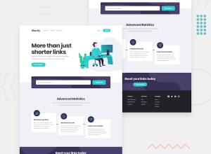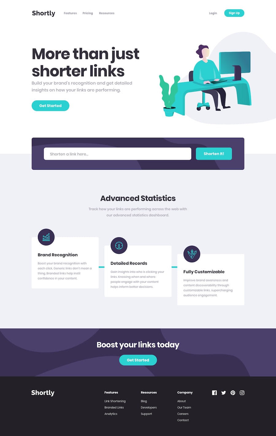
Design comparison
Solution retrospective
I will appreciate your honest feedback, thank you soo much.
Community feedback
- @AdrianoEscarabotePosted about 2 years ago
Hi Diego Fernando Cuevas Amaya, how are you? I really liked the result of your project, but I have some tips that I think you will enjoy:
Every html document must contain a main tag, to inform what is the main content of the page, as this page is a complete page, that is, it has a header a main and the footer, wrap the main content with the main tag , for users who use screen readers, to be able to understand what the main content of the screen is!
I noticed that the content is stretching a lot in higher resolutions, to solve this we can put a
max-width, only in the div that has the content so that the background colors do not stop stretching! this will make the page design nicer at higher resolutions!The rest is great!
I hope it helps... 👍
0 - @Cheikhna-sakhoPosted about 2 years ago
Bonjour, j'ai checké, j'aimerais faire un retour je suppose que tu es débutant en react, le rendu est là mais ce serait bien si tu pouvais découper ton code en d'autres composants et essayer de faire des itérations map sur les codes qui ses répète.
0
Please log in to post a comment
Log in with GitHubJoin our Discord community
Join thousands of Frontend Mentor community members taking the challenges, sharing resources, helping each other, and chatting about all things front-end!
Join our Discord
