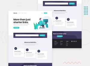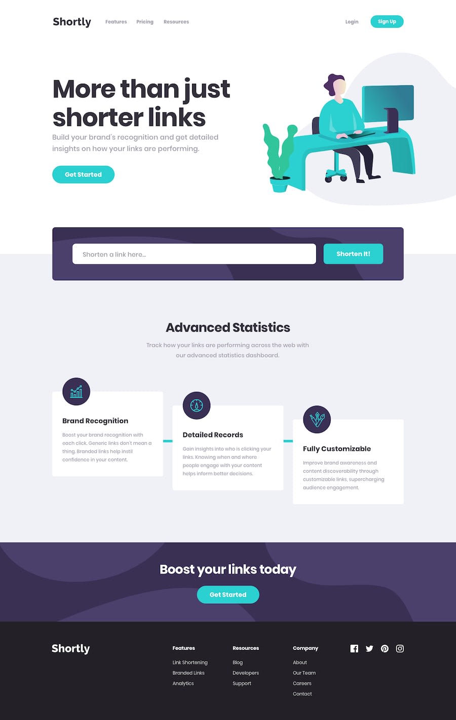
Design comparison
SolutionDesign
Solution retrospective
Liked this one. Took a while to get the hang of state management, but you can quickly see how it comes in handy even for simpler projects (in terms of data needs) like this.
I'm sure there's a more elegant way I could have done the hero image, couldn't get it to play nice without shrinking the hero content or messing with the screen widths. Got there in the end, but is there a better way of doing this?
Any other advice v much appreciated!!
Community feedback
Please log in to post a comment
Log in with GitHubJoin our Discord community
Join thousands of Frontend Mentor community members taking the challenges, sharing resources, helping each other, and chatting about all things front-end!
Join our Discord
