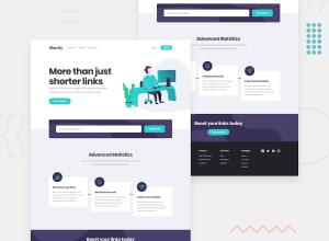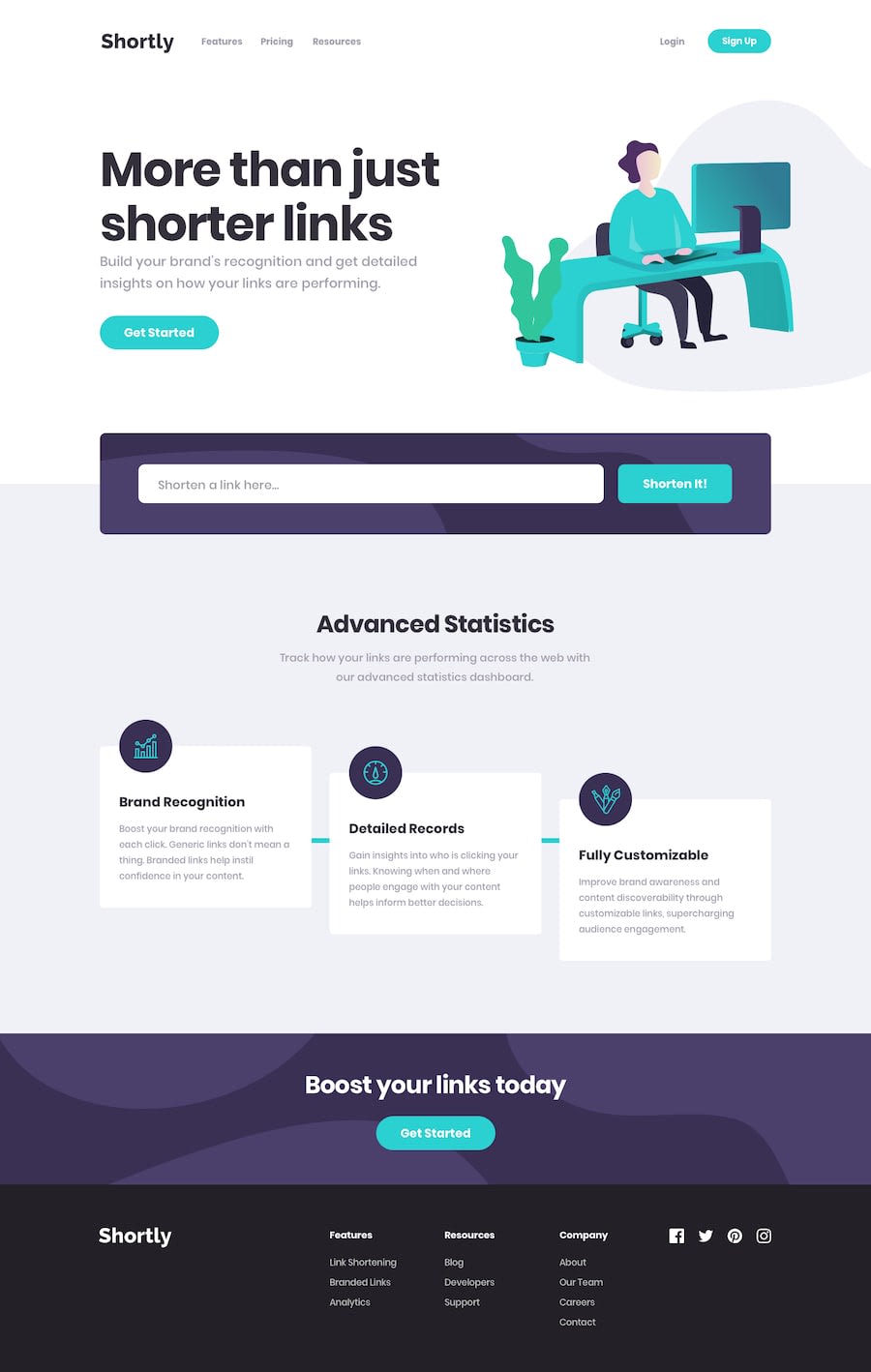
Design comparison
SolutionDesign
Community feedback
- @viniciussisPosted 9 months ago
I really liked your solution, especially the animation of the Shorten It button. I wish I had come up with that idea 😂. The only small issue I found was with the hover effect on the login, other than that, it looks perfect.👍🏻
1
Please log in to post a comment
Log in with GitHubJoin our Discord community
Join thousands of Frontend Mentor community members taking the challenges, sharing resources, helping each other, and chatting about all things front-end!
Join our Discord
