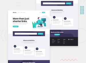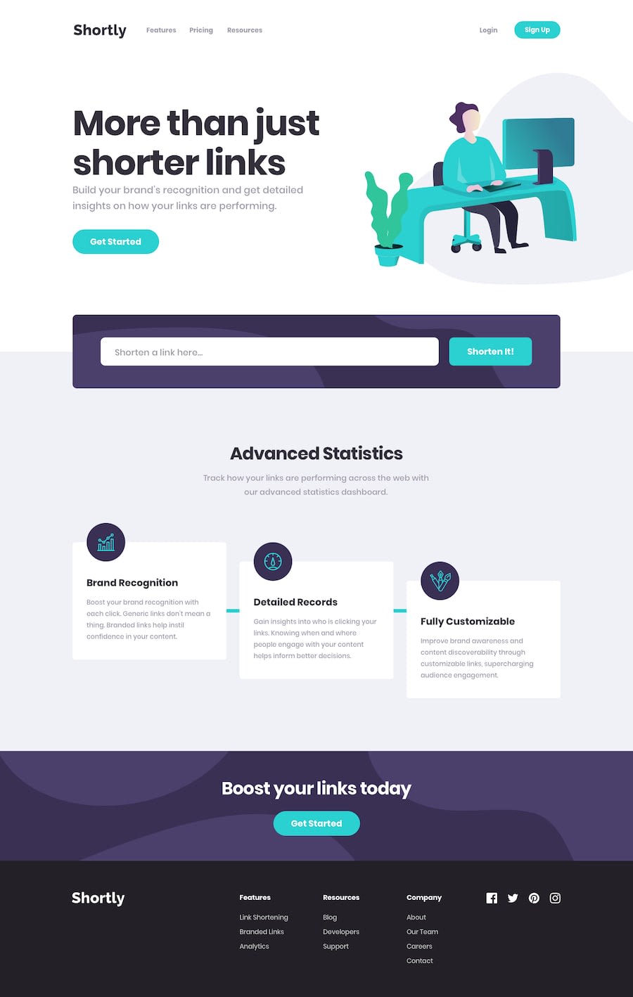
Design comparison
Solution retrospective
Hi all, this is my frontend mentor project, in which I had to create a web page that consumes an API for URL shortening. I used axios, reactjs and sass to develop the page. The hardest part was making the CSS fully responsive and adapting to different screen sizes and devices. Many times the design broke or didn't look good. I also had difficulties to make some CSS interactions with javascript, like the copy animation that shows a message when a shortened URL is copied. I would like to know if you have any advice or suggestions to improve my code or layout. Thanks for your time and attention.
Community feedback
- @Guille-SanchezPosted over 1 year ago
Hi friend! It looks pretty good. I took a quick look at the website and you had very good ideas. one of the things you may try to implement to the website is to save the shorthen-urls on "local-storage", and retrieve those links after the page is refresh. This brings a better user experience. You should also include a button to delete the links and things like that.
Another thing I noticed is that you used really good semantic HTML, but you may have forgotten (or I did not notice) to put the main tag.
Overrall it is pretty well-made the website and you should be happy for what you have made. Congrats!
Marked as helpful1
Please log in to post a comment
Log in with GitHubJoin our Discord community
Join thousands of Frontend Mentor community members taking the challenges, sharing resources, helping each other, and chatting about all things front-end!
Join our Discord
