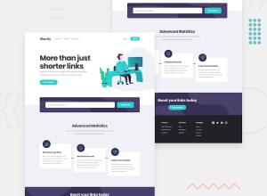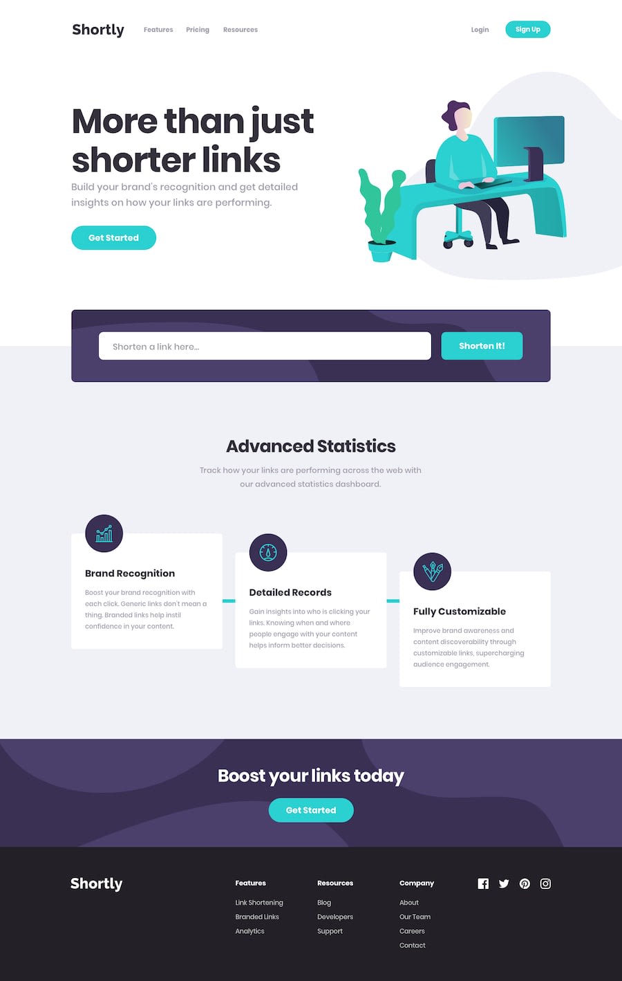
Design comparison
SolutionDesign
Solution retrospective
- With vite and vue it's so fast to bootstrap a way to manipulate dom with existing layout.
- The solution is not fully responsive and on of the reason it's a bad idea to skip medium screen sizes and start with large screen after mobile.
- In the first section I probably should've illustration as a background-image rather than img in the layout.
- Better to define all content padding from the start (eg in body)
Community feedback
Please log in to post a comment
Log in with GitHubJoin our Discord community
Join thousands of Frontend Mentor community members taking the challenges, sharing resources, helping each other, and chatting about all things front-end!
Join our Discord
