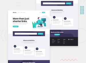
Design comparison
Community feedback
- @ThabisoMagwazaPosted 12 months ago
This is very nice solution. I love how you added error handling and the delete button on each url. Those were nice touches!
I woud, however, caution against straying from the design when implementing such challenges. It's an interesting test of your attention to detail when you attempt to get the final application to look as close to the design as possible.
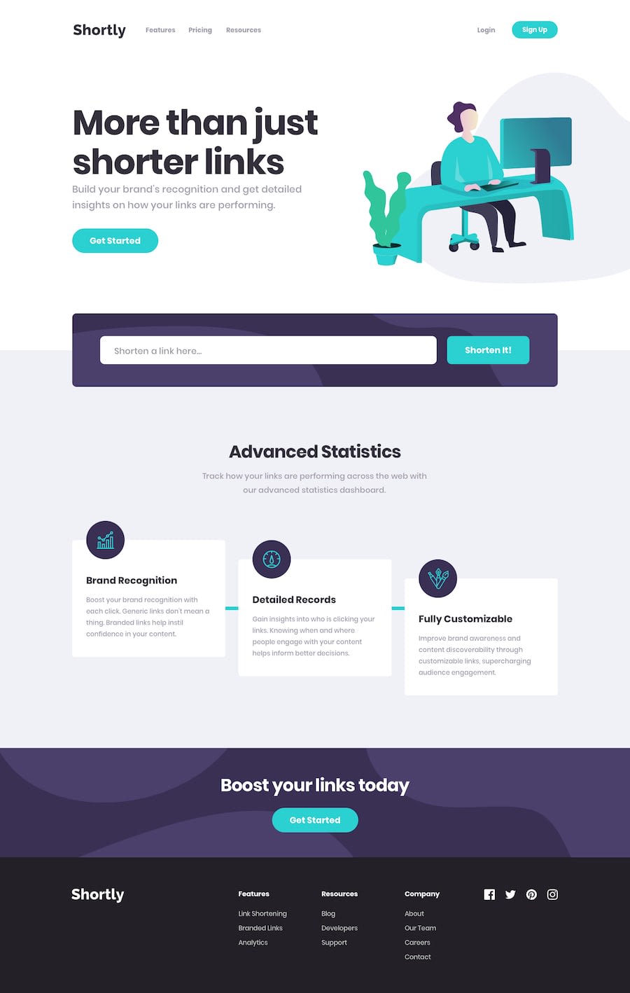
These are some of the areas I've identified where you strayed from the design:
- Some button and links hover states are incorrect
- The font sizes and whitespaces are not as per design
- The mobile navigation is missing and the mobile design is broken
I'm sure you can find some more. I suggest that you look throught the design again while paying close attention to the whitespace, hover and active stetes.
You have an impressive grasp of CSS and I'm sure you'll benefit from the challenge!
0
Please log in to post a comment
Log in with GitHubJoin our Discord community
Join thousands of Frontend Mentor community members taking the challenges, sharing resources, helping each other, and chatting about all things front-end!
Join our Discord
