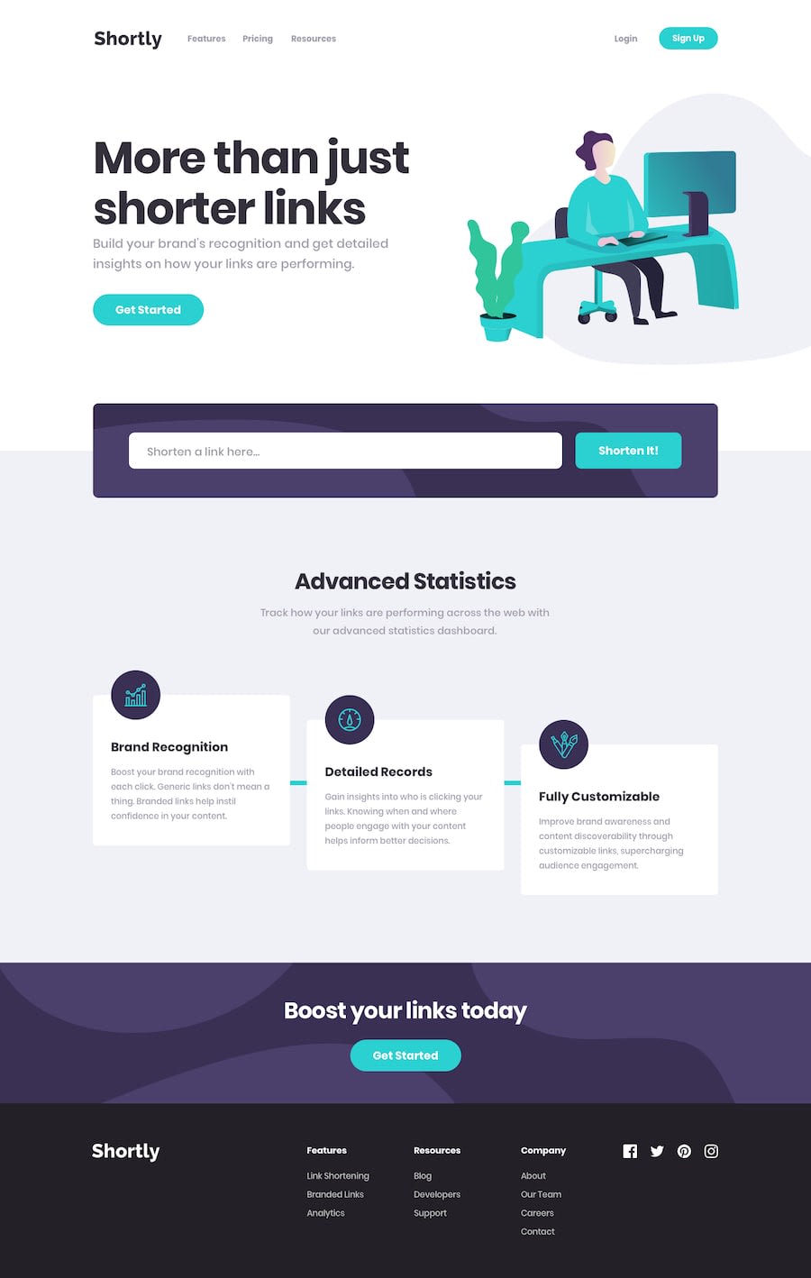
Design comparison
Solution retrospective
This challenge was a little bit difficult , I hope I did well with layouts and js functions please give me your feedback thanks
Community feedback
- @hebrerilloPosted over 2 years ago
The text of the "shorten it" button breaks into a new line. One quick solution would be to set the property: 'white-space: nowrap'
After that, you would have to add a padding to the button to make it like the initial design.
A more elegant solution would be to refactor the parent of the button and the input field, and wrap the input field into another container. The management of input fields inside of a flex container can be painful.
Marked as helpful0@AhmaadAlharbiPosted over 2 years ago@hebrerillo thank u so much for your feedback , I will fix it
1
Please log in to post a comment
Log in with GitHubJoin our Discord community
Join thousands of Frontend Mentor community members taking the challenges, sharing resources, helping each other, and chatting about all things front-end!
Join our Discord
