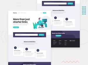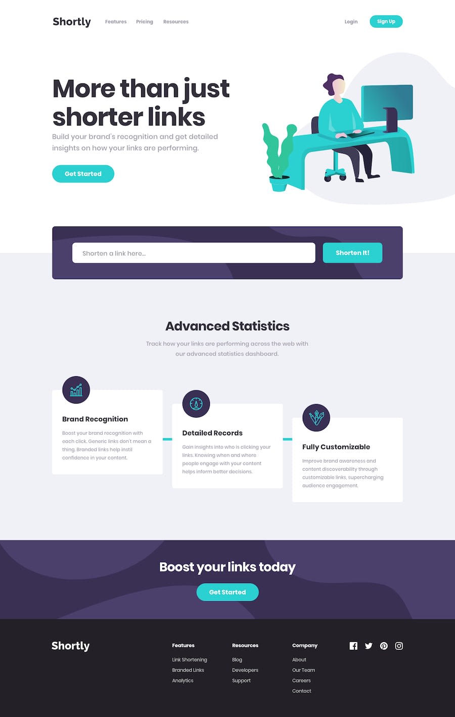
Design comparison
Solution retrospective
I really love those challenges, and doing them made me comfortable and confidence about my skills that are growing. Also I have a question, when I done challenges I usually use accessibility tool in Firefox it shows me some accessibility issues, some are I made it, but some of them related to the design required in the challenge, I want your words on this if you interested or have same issue, thanks♥.
Community feedback
- @SenatriusPosted over 4 years ago
Hello there.
The page looks pretty good, seems to be responsive on all screens and the code (at least parts of code I can understand, haven't learned React quite yet) seems clean and easy to read.
If there was one thing though, the navigation links in the header are the wrong color. Also the buttons and input fields could probably do with a little bit of extra padding. Other than that, this seems good to me :)
As for the accessibility, I personally just leave the way it is in the design preview. If the color contrast is off, then it's off, if the form doesn't have a label then I guess it won't have a label. It breaks some guidelines, but I'm sure the UI designers wouldn't appreciate developers changing up their design in the real workplace either, so it is what it is :)
Keep up the good work!
2@akamfoadPosted over 4 years ago@Senatrius thank you so much, I appreciate your words. about the navigation links, I noticed that issue and it went away when I refreshed the page, but I have to refactor it, there is some bugs and place to cleanup, thanks for feedback again♥
1
Please log in to post a comment
Log in with GitHubJoin our Discord community
Join thousands of Frontend Mentor community members taking the challenges, sharing resources, helping each other, and chatting about all things front-end!
Join our Discord
