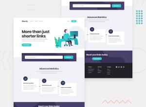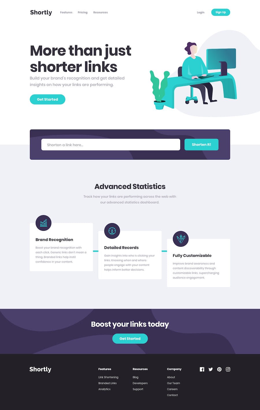
URL shortening API landing page [React.js]
Design comparison
Solution retrospective
I am still quite new to React and Tailwind CSS so pardon me that there are some bugs in this solution, especially the CSS (tailwind) parts - which could have been more easily resolved if I am using plain CSS and Javascript. Nevertheless, the whole point here is for me to learn and practice using React and Tailwind CSS.
Please let me know if you know how to solve the bugs. Thanks!
Community feedback
- @DomilsonFirminoPosted over 1 year ago
You solutions is good, but there are somethings from the design source that maybe have slipped from your attention;
When a link is shortened and present it seens as it is out of the flow of the normal content; Your card and menus seams to be different to, but beside that everything is good and functional congratis for it; I would like to proved how to corrects some of the things i pointed out but i can't sorry
0
Please log in to post a comment
Log in with GitHubJoin our Discord community
Join thousands of Frontend Mentor community members taking the challenges, sharing resources, helping each other, and chatting about all things front-end!
Join our Discord
