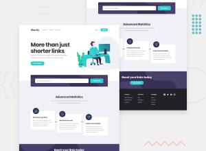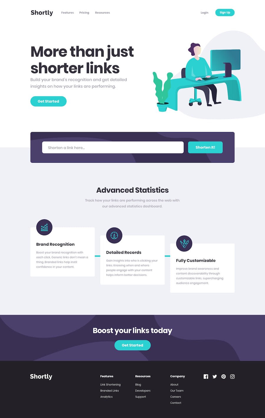
Design comparison
Solution retrospective
The most notable challenges were learning to integrate the TinyURL API to shorten links and ensuring correct functionality across different devices and browsers. To overcome them, I researched and consulted the API documentation extensively, as well as conducted thorough testing in various environments to identify and address potential compatibility issues.
What specific areas of your project would you like help with?I'd appreciate assistance with optimizing the performance of my landing page, particularly in terms of loading times and responsiveness. Additionally, guidance on improving the user experience and enhancing the visual design would be valuable.
Community feedback
- @snhasePosted 6 months ago
Hello Elias,
Great job with the challenge! It is responsive and API integration works very well!
I just completed this challenge too and have some minor suggestions to improve the UX/visual design even more :
- the copy button does copy but gives an alert instead of changing the copy button text that to in spanish that not all users understand. Suggesting to change the copy button text to "copied" instead . One way is by using a state variable and using conditional rendering to update the button text.
- the design has a blue connector going through the features cards, one way to add that is to use z-index, tailwind css has z-index utility, check it out here - https://tailwindcss.com/docs/z-index
- storing the shorten url list in local storage so the user can have history of the urls shortened
Hope this helps!
snhase
Marked as helpful0
Please log in to post a comment
Log in with GitHubJoin our Discord community
Join thousands of Frontend Mentor community members taking the challenges, sharing resources, helping each other, and chatting about all things front-end!
Join our Discord
