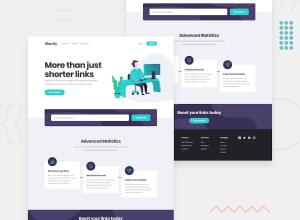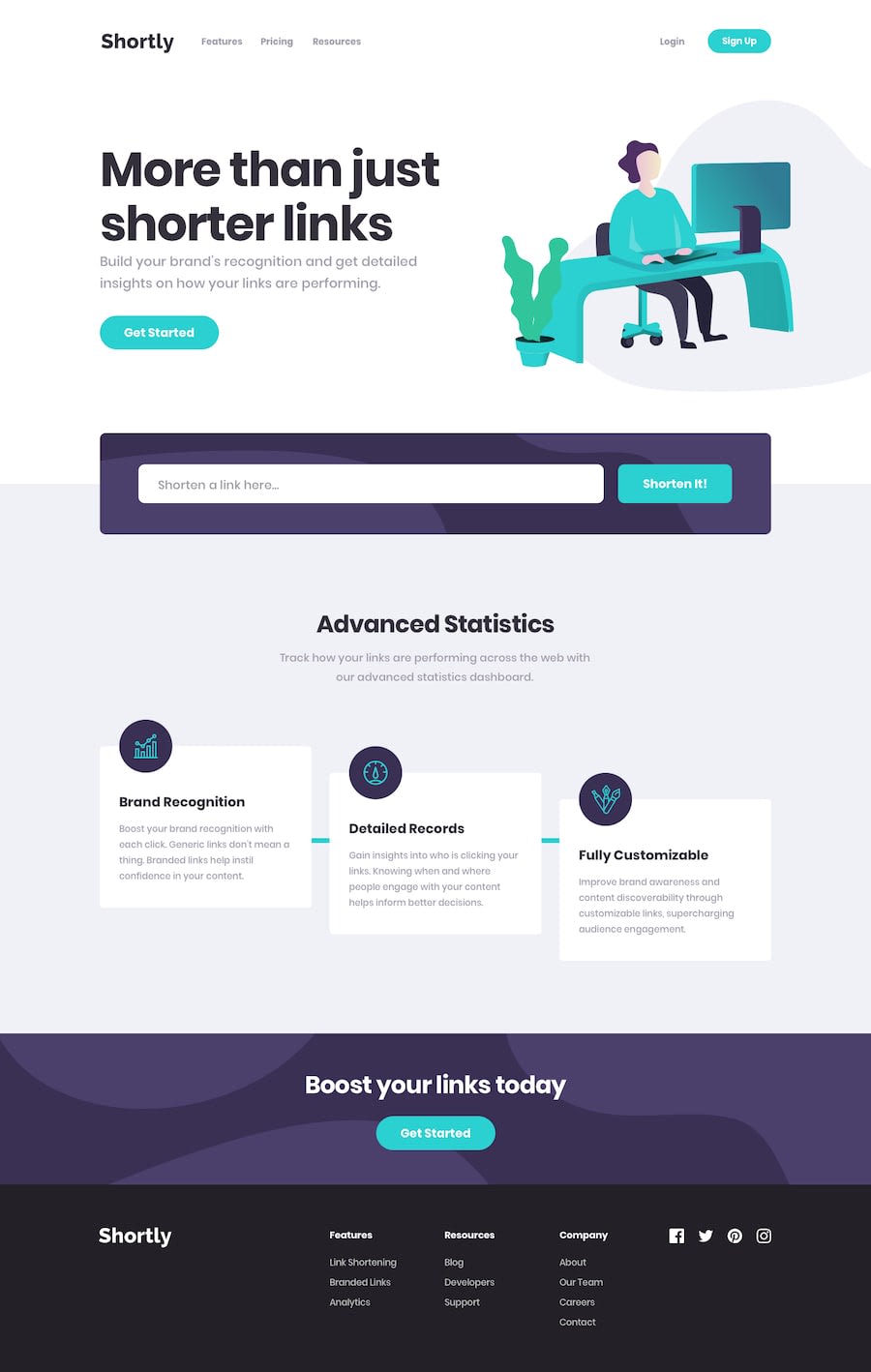
Design comparison
Solution retrospective
I couldn't figure out how to add the cyan line between the 3 boxes so if anyone could point me in the right direction I would be so grateful.
Please feel free to check (break) my code and give pointers. Cheers!
Community feedback
- @dwhensonPosted almost 3 years ago
Hey @Kwill3 Lovely job here! 🥳 The site looks great and responds nicely.
Some small suggestions:
-
Regarding HTML, I would suggest putting all the links in the footer inside a
navelement like you have done for the main nav at the top of the page. -
On CSS, it all looks solid to me, but I would have another look at the top navigation alignment and approach you have used. It should be fairly easy to align things centrally using nested flex boxes, and
align:center. -
For JS, I would suggest two things: 1) When the user clicks the shorten link button, perhaps give some feedback that it worked (e.g. some animated dots something?), but more importantly, do some validation and provide feedback to the user if they entered an invalid string.
If you replace the
link.value === '' || link.value == nullwith a more robust validation function this could work perhaps? I used the following, which returns a boolean.function validateUrl(url) { return /[\w#%+.:=@~-]{2,256}\.[a-z]{2,6}\b([\w#%&+./:=?@~-]*)/.test(url); }Also, if you enter something that won't work you will actually be able to see in the console that the API returns some error messages, you can capture the error message and render its content to the page to inform the user what happened.
I'm sure there's better solutions out there, but here's the repo for my solution in case it helps. https://github.com/dwhenson/frontendmentor-url-shortner/tree/3aecdbd26d59288dc060e2ed20e48e035ca2cd00
Keep up the great work and let me know if I can clarify anything.
Cheers 👋
Dave
Marked as helpful1@Kwill3Posted almost 3 years ago@dwhenson thanks for taking time to read my code, I will try to implement the suggestions you have made, in fact I was gonna implement the error codes in JS but I completely forgot about them because I was so excited to share my attempt so thanks for reminding me.
Can you briefly teach me how to get the cyan line between the 3 boxes at the bottom?
0@dwhensonPosted almost 3 years ago@Kwill3 so I had the three boxes wrapped in a
uland then I used a pseudo element to create the line, with the following code:content: ""; position: absolute; inset-block-start: 50%; inline-size: 40rem; block-size: 0.5rem; inset-inline-start: 4rem; inline-size: 80%; transform: translateX(0) rotate(0);Not sure if that approach can work for you?
Cheers!
Marked as helpful0 -
- @NaveenGumastePosted almost 3 years ago
Hay ! William Lee Good Job on challenge
-> Check out my article on accessibility issues
If this comment helps you then pls mark it as helpful!
Have a good day and keep coding 👍!
1
Please log in to post a comment
Log in with GitHubJoin our Discord community
Join thousands of Frontend Mentor community members taking the challenges, sharing resources, helping each other, and chatting about all things front-end!
Join our Discord
