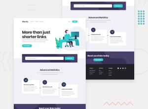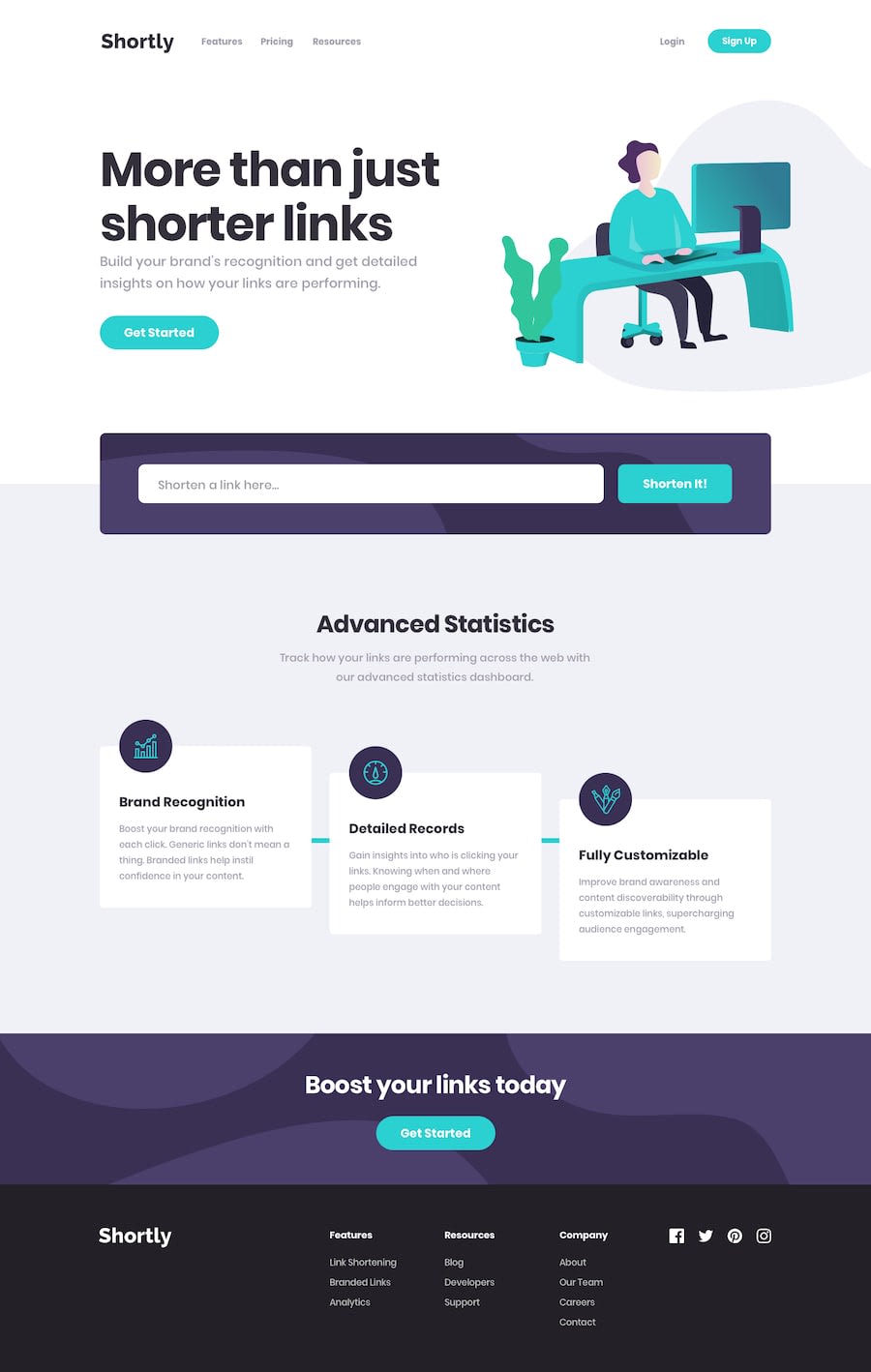
Design comparison
SolutionDesign
Solution retrospective
Hi everyone! Here are some mistakes I've made during completing this challenge:
- tried using "overflow-y: hidden" for my navigation menu, but it's not working in Opera;
- i added cyan lines for "Statistics" section via pseudo-elements. but i failed trying to position them with for desktop resolution;
- tried to add static brands images, but my page only displays "pinterest" link. so, i decided to totally replace them to font awesome icons;
- my SCSS file looks kinda huge. perhaps, any implementation of mixin would be awesome.
Any feedback would be useful.
Community feedback
- @ZeyadMohamed1805Posted almost 2 years ago
Amazing work right there bro! I do have some suggestions for you:
- The ::after element in the desktop version, you grasped the concept, you just need to place it. A quick fix for that is to reverse the width & height properties on the desktop (set the width to 100% & height to 8 px). From there you can set the top to 50% & the left to 100%. I hope that fixes it.
- Try to reduce the width of the main image (setting the max-width is best) & implement the color of the header next to the image.
Thats all I have for you! Other than that, You did a great job and your hard work really shows.
0
Please log in to post a comment
Log in with GitHubJoin our Discord community
Join thousands of Frontend Mentor community members taking the challenges, sharing resources, helping each other, and chatting about all things front-end!
Join our Discord
