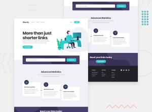
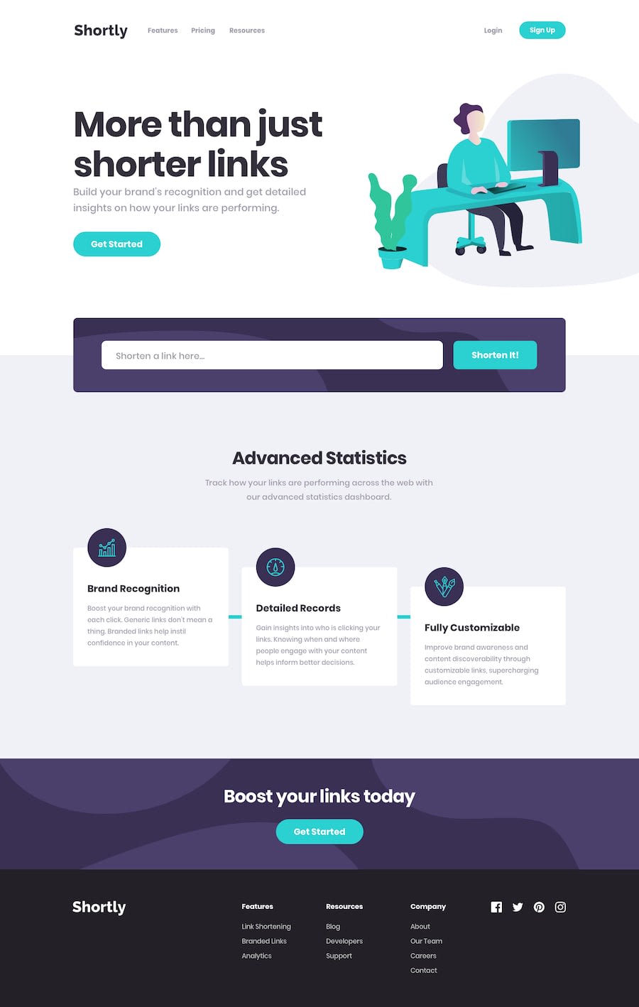
URL shortening API landing page (React 🚀 + SASS modules + Axios)
Design comparison
Solution retrospective
Hi there 👋, I’m Melvin and this is my solution for this challenge. 🚀
Questions:
- In React, what is the most popular class naming convention?
- I've read that it's not recommended to have three or more nested folders within a project, so what's the most common way to organize files in React?
Features:
- 🔧 Focus on button using forwarding references
- 🔧 Using localStorage to save url
- 🔒 Form validation with react-hook-form
- 🔔 Notifications with react-toastify
- 🎨 Custom scrollbar
Built With:
- React-JS
- SASS modules
- BEM naming convention
- Axios - Dotenv
- react-hook-form
- react-toastify
- Yarn - Vite
Any feedback on how I can improve and reduce unnecessary code is welcome!
Thank you. 😊✌️
Community feedback
- Account deleted
Hi; if you want to know a better way to organize your code, the most common way is just copy a folder structure already implemented by other programmers; the atomic design is very common, just get deep with the topic, is really useful.
This project is amazing to use it as a reference to reach a pro level with react https://github.com/Th3Wall/Fakeflix
Marked as helpful1 - @BishwashKumarSahPosted almost 2 years ago
Hey! I just wanted to know how you guys manage to get the same design. When I try to do it then it is either bigger or doesn't match the design of this website. Any suggestion you could give to improve that?
3@MelvinAguilarPosted almost 2 years ago@BishwashKumarSah Hi!!
Well, there are a few options:
- You can become a PRO member of the platform to have access to the Figma designs where you can find the most exact measurements.
- You can use an extension called PixelPerfect. In this extension you can put a semi-transparent image (e.g The
desktop-design.jpg
) on top of the page and see if the solution looks like the image. However, you have to put the page at 1440px otherwise it doesn't work - Try and failure
Setting the page to 1440px is because the
desktop-design.jpg
image comes in that resolution, and setting the page to 1440px means using the DevTools to simulate a 1440px screen.Although honestly, in large projects the pixelPerfect it is a headache. This is why it is recommended not to make it pixelPerfect, because you can never have it exactly as the design
Happy coding! 😁 🎄
7@Julius-JavaPosted almost 2 years ago@MelvinAguilar Chief is there any way I can connect with you, It would be really awesome honestly.
0@BrainboyioaPosted almost 2 years ago@MelvinAguilar Honestly.. thanks for this piece....
1@matusalab-devPosted almost 2 years ago@BishwashKumarSah if you can't afford the pro membership I'll recommend you to watch this video. https://youtu.be/JdCW-dR08ms and codercoder's Frontend mentor challenge youtube video
1Account deleted@MelvinAguilar parabéns pela posição que você e outros membros têm aqui na plataforma. Isso mostra que vocês trabalham duro para conseguir o que querem. Por favor, gostaria de saber como vocês conseguem concluir esses lindos projectos?
0 - @diyorbek-alikuzievPosted over 1 year ago
"frontend mentor" is left at the bottom, we don't need it
0@MelvinAguilarPosted over 1 year ago@diyorbek-alikuziev I don't understand the comment, greetings!
0 - @DexLuthorPosted almost 2 years ago
I'm very skeptical about 3 folders rule 🤔
From my experience when, for smaller projects we do have low nesting.
emmet syntax following to depict
src>components>compa+compb^services+guards+guards+...
for medium+ projects we do modules federation in first place. then for every federated module we have
src
folder.src>modules>module-a>components+pages+...> and it can go endlessly deep.
Only depends on how complex your pages are. this typically happens to bloody enterprise :D
0
Please log in to post a comment
Log in with GitHubJoin our Discord community
Join thousands of Frontend Mentor community members taking the challenges, sharing resources, helping each other, and chatting about all things front-end!
Join our Discord