

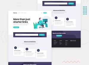
Design comparison
Solution retrospective
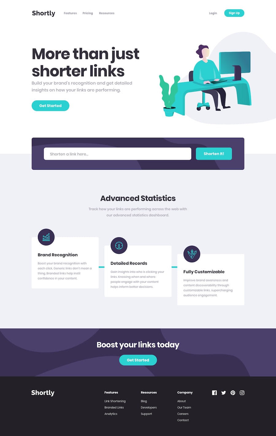
I'm not satisfied with the rounded icons. The icons are not completely centered.
Also, I wasn't sure how to do correctly the hover and focus effects on the buttons, so I've only used opacity.
For each part of the page I've tried to created a custom component in React. But I don't know if they were used correctly:
- Navbar,
- Hero,
- Links, for the links section
- Link, for each individual link
- Body
- Footer
Community feedback
- @PeshwariNaanPosted about 2 years ago
Hello Kamil - Nice work on completing the challenge.
Here are a couple tips that might help:
-
For the components, you did pretty good. I would make the input its own component. You can make all the buttons one component and change the sizes and shapes with props. Also the cards that have the icons on them could be components as well. Rename the body component to layout.
-
The hover affect looks fine for this project. You could also have changed the shade of color but it's just a different solution, not better.
-
Also if you want to get rid of the landmark warnings just wrap a <main> tag around your root div in the index.html file like this:
<main>
   <div id="root"></div>
</main>
I hope this helps - Happy coding
Marked as helpful0 -

Please log in to post a comment
Log in with GitHubJoin our Discord community
Join thousands of Frontend Mentor community members taking the challenges, sharing resources, helping each other, and chatting about all things front-end!
Join our Discord