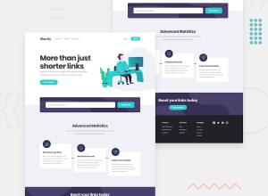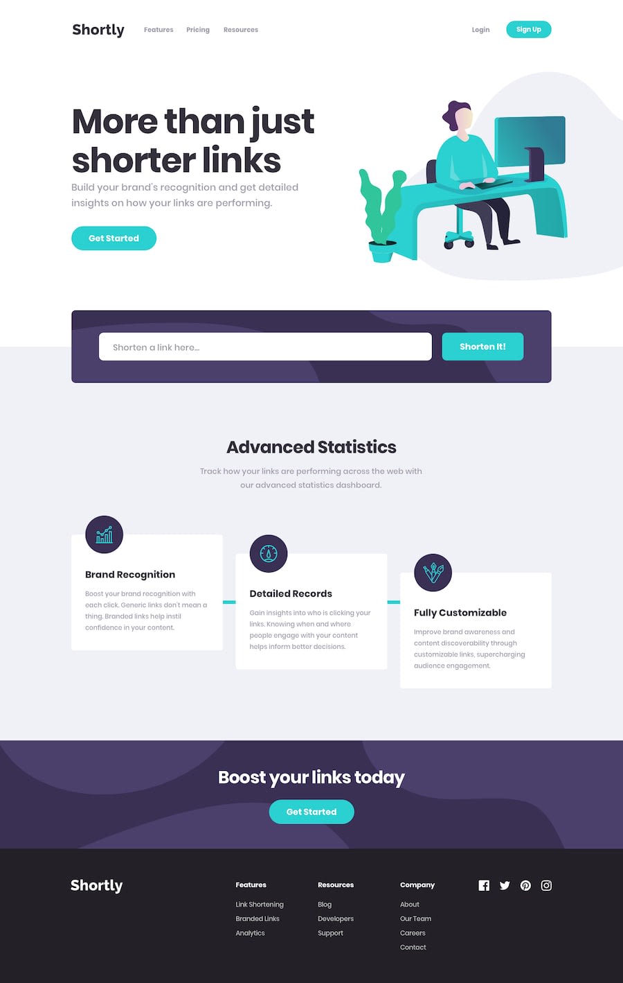
Design comparison
SolutionDesign
Solution retrospective
Did mobile first pretty happy with that result. Desktop version needs fixing but if you only use the layout from the style-guide (1440px) its alright.
Any feedback appreciated :)
Community feedback
Please log in to post a comment
Log in with GitHubJoin our Discord community
Join thousands of Frontend Mentor community members taking the challenges, sharing resources, helping each other, and chatting about all things front-end!
Join our Discord
