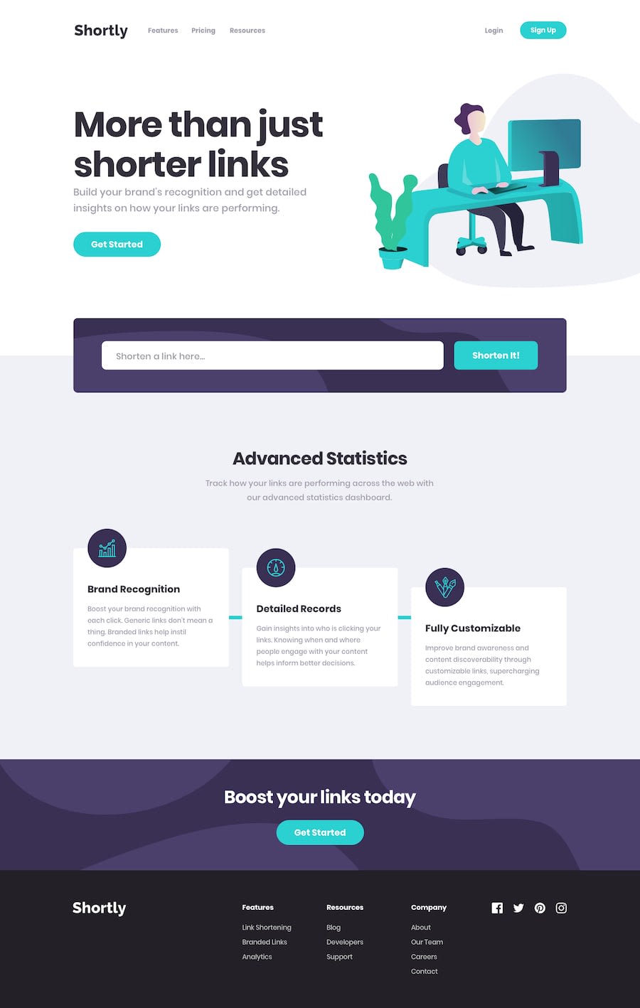
Url shortening - React, Typescript, Zod, Zustand
Design comparison
Solution retrospective
Hello, this is my solution for this challenge.
This project was made in React + Typescript. The API I used is bitly's. To consume the API I used axios, as it makes this task quite easy. To validate the information coming from the API I used Zod. For the global state, Zustand was used, an excellent option to do this activity. For styles use normal CSS
Community feedback
- @brunomoletaPosted 5 months ago
(Please check the Pull Request at your Git hub repo)
Hello Eduardo, how have you been?
I took some time to review your project.
The most important advice for you is to make the React components shorter. You can also divide the CSS into multiple smaller files as it gets easier to read and edit.
The HTML structure shall be
<header>...</header>
<main>...</main>
<footer>...</footer>
But the code provided had a
mainwith only a few lines and many elements 'loose' directly at the body.Also, at the
headerI changed it to two separate nav tags instead of one large one.:<header className="header"> <div className="header__container"> <div className="header__navbar"> <img src="/logo.svg" alt="logo" /> <MenuButton /> <Nav /> <NavForm /> </div> </div> </header>I also created a
data.tsfile where all data can be stored, where the marketing team would fill, in a real scenario, and the components can stay the same wherever the change, please seeMenuMobile.tsx.Adjusting the components broke part of the layout, and changes in the
csswould be necessary.Congrats on the project, and keep up the effort.
Best regards from 🇧🇷
Marked as helpful0
Please log in to post a comment
Log in with GitHubJoin our Discord community
Join thousands of Frontend Mentor community members taking the challenges, sharing resources, helping each other, and chatting about all things front-end!
Join our Discord
