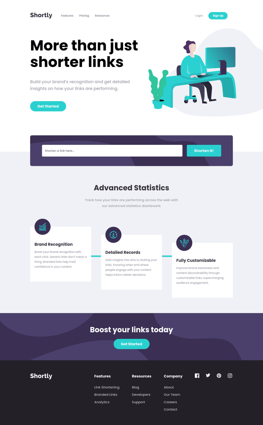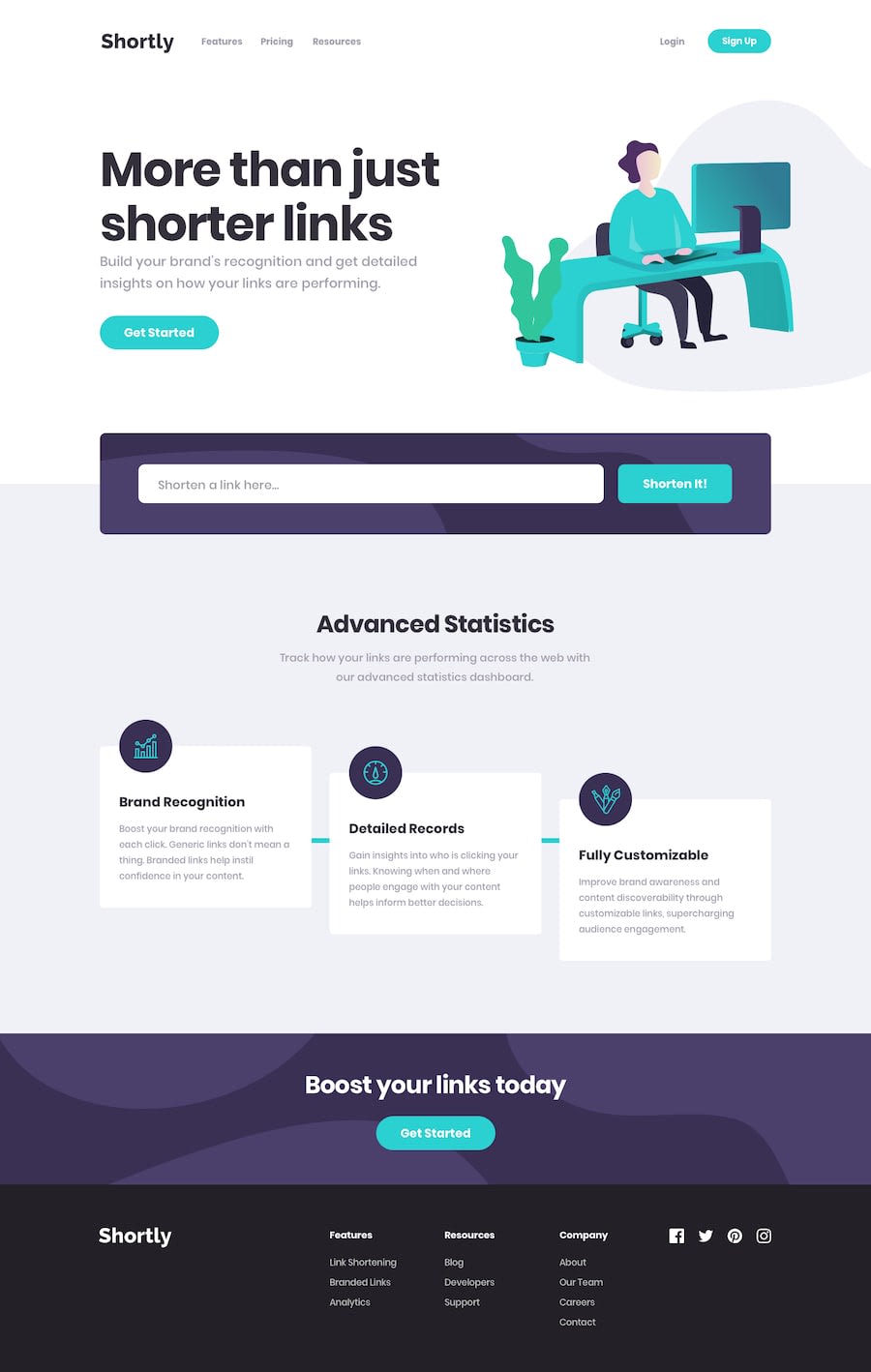
Design comparison
SolutionDesign
Solution retrospective
Any valuable tips and advice would be very helpful to improve my skills. Have a nice day!
Community feedback
- @kens-visualsPosted about 3 years ago
Hey @ruedasjnthn 👋🏻
I have a couple of suggestion to help you fix the accessibility and HTML issues.
- In your markup,
<div class="header">...</div>should be<main class="header">...</main>and<div class="footer">...</div>should be<footer class="footer">...</footer>. <!DOCTYPE html>add this line to the top of the HTML document, and also removetype='text/css'from your ``SVG`.
These will fix the accessibility and issues, just, don't forget to generate a new repot once you fix the issues.
I hope this was helpful 👨🏻💻 Overall, you did a great job. Since I haven't done the challenge myself, I cannot give any specific suggestion about the design or the layout, but it looks good both on mobile and desktop viewport width. Cheers 👾
Marked as helpful0 - In your markup,
Please log in to post a comment
Log in with GitHubJoin our Discord community
Join thousands of Frontend Mentor community members taking the challenges, sharing resources, helping each other, and chatting about all things front-end!
Join our Discord
