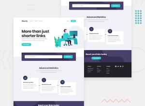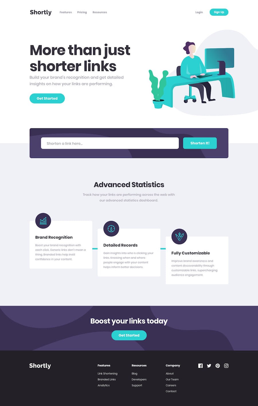
Design comparison
SolutionDesign
Solution retrospective
Please i will love your feedbacks and honest opinion as i believe there is room for improvement. Thank you
Community feedback
- @carlwickerPosted almost 3 years ago
Great job on the layout, however there are some issues....
- Desktop Hero header should be left aligned.
- Desktop Hero image should be to the right edge of the page outside the container.
- Desktop Hero section design breaks if you resize the window width.
- The form validation and warnings are missing.
- Input text is not styled.
- Links are not saved to localstorage (part of brief).
- Background grey is incorrect colour to style guide.
- Mobile menu styling is broken.
- Sign up button on navbar should be capitalised not uppercase.
- Desktop navbar needs top padding.
Finally fix those pesky accessibility and html issues in the report.
Keep up the great work.
Marked as helpful0
Please log in to post a comment
Log in with GitHubJoin our Discord community
Join thousands of Frontend Mentor community members taking the challenges, sharing resources, helping each other, and chatting about all things front-end!
Join our Discord
