Updated version using Flexbox

Solution retrospective
This time I was able to utilize something I learned recently which is Flexbox and the use of other units of measurement which really made things easier compared to using fixed width and so on. I think if I were to improve on this again, I would try using the Grid version!
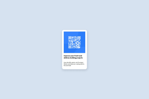
What challenges did you encounter, and how did you overcome them?I think what I encountered this time is the image? It wouldn't fit the container / card so I had to use max-width: 100 to fit it in there, but I'm not so sure if that is the correct solution.
What specific areas of your project would you like help with?I am not so confident if I did well so any feedback in terms of how I fit the items or the use of flexbox would help :) thank you!
Please log in to post a comment
Log in with GitHubCommunity feedback
No feedback yet. Be the first to give feedback on Jas's solution.
Join our Discord community
Join thousands of Frontend Mentor community members taking the challenges, sharing resources, helping each other, and chatting about all things front-end!
Join our Discord