Design comparison
Community feedback
- @AdrianoEscarabotePosted about 1 month ago
Hello halovii, how are you? I was really pleased with your project, but I’d like to offer some advice that might help:
To enhance the semantics of your code, consider using a
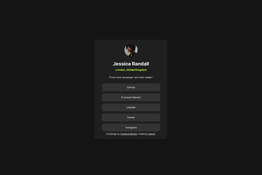
<ul>(unordered list) for the collection of links, as it represents a list of related items. Here's an example:<ul> <li><a href="#">GitHub</a></li> <li><a href="#">Frontend Mentor</a></li> <li><a href="#">LinkedIn</a></li> <li><a href="#">Twitter</a></li> <li><a href="#">Instagram</a></li> </ul>Using a
<ul>provides clear structure and context, signaling to both browsers and assistive technologies that these links are part of a cohesive group, improving both accessibility and readability.The rest is spot on.
Hope it’s helpful to you. 👍
Marked as helpful1 - @asimsaeed353Posted about 1 month ago
Impressive effort and yeah GitHub is confusing sometimes haha. I have a suggestion, add styles to your
<a>for hover and focused state. That'll improve the design for sure. Keep up the good work!1
Please log in to post a comment
Log in with GitHubJoin our Discord community
Join thousands of Frontend Mentor community members taking the challenges, sharing resources, helping each other, and chatting about all things front-end!
Join our Discord
