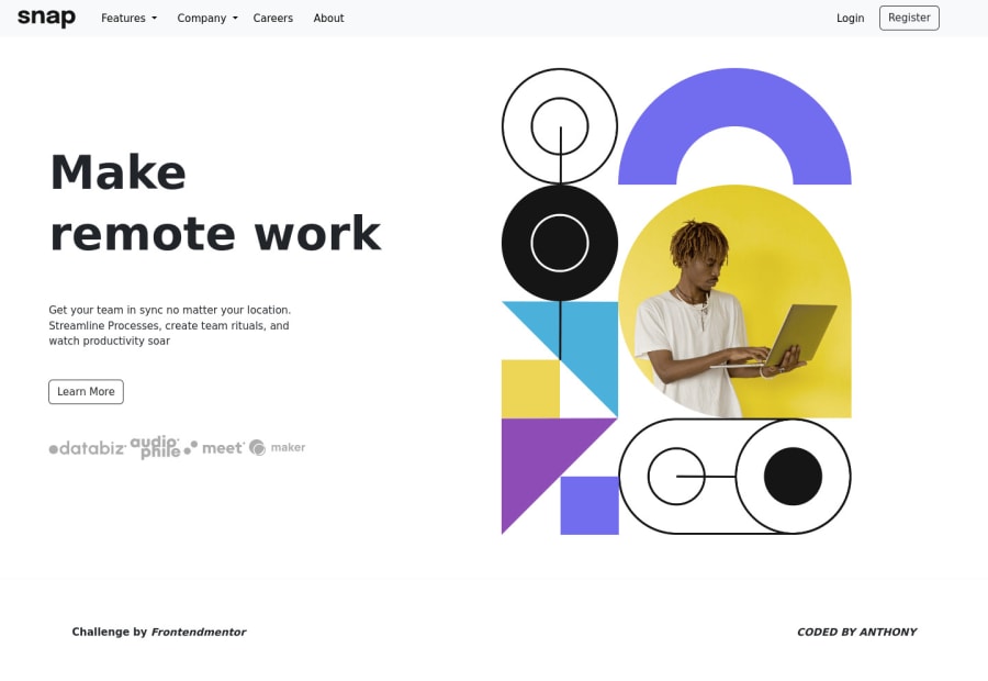
Design comparison
Solution retrospective
i sill have issues with the mobile design...pls anyone who has an idea on that should please check the code and help me out
Please log in to post a comment
Log in with GitHubCommunity feedback
- @Har1s-Akbar
Nice try there are few things i would like to point out in your mobile version. It seems you are using max width for the text on mobile version too, you should use 60%-50% width on text with m-auto to center it. if you want to center it without reducing the width you should use text center css property. I would suggest you decrease the text-size, text width on mobile version with text center. I would also suggest you to use tailwind css because it rids you of trouble of writing the css in separate file.
Join our Discord community
Join thousands of Frontend Mentor community members taking the challenges, sharing resources, helping each other, and chatting about all things front-end!
Join our Discord
