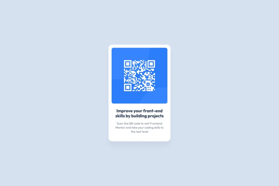
Design comparison
Community feedback
- @Thewatcher13Posted over 1 year ago
Hi, I've analyze your code and note a few things.
html
- Your alt on the img is empty, be sure you have an alt for important pictures, not for decorative picutures. It provide accessilibility. Screenreaduers use it.
- You should have a main landmark role in every project.
css
-
Use a css reset, look on Andy's bell his website for a good and clear one
-
Never ever set font-sizes in px (absolute value), but in relative (rem) https://fedmentor.dev/posts/font-size-px/
-
give the h1 and p tag also a class, it is better to do this.
-
Don't set a height on an image
-
Try to create the design as much as possible, your img has no border-radius like on the design. Your solution has to much padding.
I have written a solution with an explanation for beginners.
I gave feedback to a few people and saw that they do the same things wrong, so I decide to write this solution. I think it could be really helpful for you.
So you can read my solution with explanation here:
https://www.frontendmentor.io/solutions/qrcode-solution-with-explanation-0LCmcOmbrj
Marked as helpful1@vedadnurkanowitzPosted over 1 year ago@Thewatcher13 Thank you very much for your feedback. I intend to refactor my code regularly, and I will take all this things and implement them in my next projects for sure. These advices are very helpful. Thanks again.
0
Please log in to post a comment
Log in with GitHubJoin our Discord community
Join thousands of Frontend Mentor community members taking the challenges, sharing resources, helping each other, and chatting about all things front-end!
Join our Discord
