


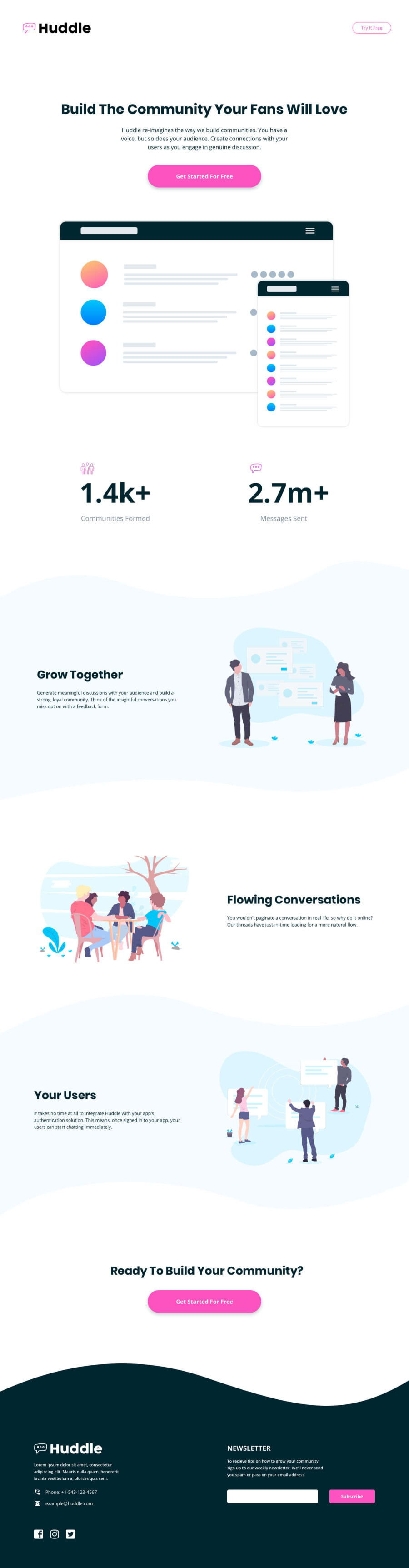
Design comparison
Solution retrospective
the backgrounds of the 1st and 3rd sections in the main chunk of the website were hard to implement but turned out really well in the end
What challenges did you encounter, and how did you overcome them?all of this is a challenge please help
Community feedback
- @Code-BeakerPosted 11 months ago
Hello there, I visited your live site URL. Overall you've done a great job with the mobile design. However, some things need to be changed in your HTML.
- The "Try It Free" button in the navigation bar must be a
buttonor ana. It is supposed to be a link styled to resemble a button. So, consider not usingdivas a button as it ruins the HTML. - Same with the "Get Started For Free" button. It should be an anchor or a button. Don't use
divto implement a button. - Please note that the heading levels should only decrease by one and not increase. Let me clarify it using a code block below: Don't do this:
<h1></h1>
<h2></h2>
<h2></h2>
<h1></h1>
This will make it hard to navigate the website for users who depend on assistive technology like a screen reader. If you aim to achieve a specific
font-size, style it using CSS instead of depending on heading tags.- Use
remunits forfont-size,margin,padding,border-radius, etc. - If you're feeling a little confused about the media query's syntax, you can try out a new syntax that is easier to read and understand:
For a screen size that is less than 50rem:
@media screen and (width < 50rem) {
/* code here */
}
You can learn about this syntax and how to use media queries from this MDN Documentation
Hope this helps you and good luck on your next project! 😃
Marked as helpful0 - The "Try It Free" button in the navigation bar must be a

Please log in to post a comment
Log in with GitHub
Join our Discord community
Join thousands of Frontend Mentor community members taking the challenges, sharing resources, helping each other, and chatting about all things front-end!
Join our Discord