Design comparison
Community feedback
- @grace-snowPosted about 2 years ago
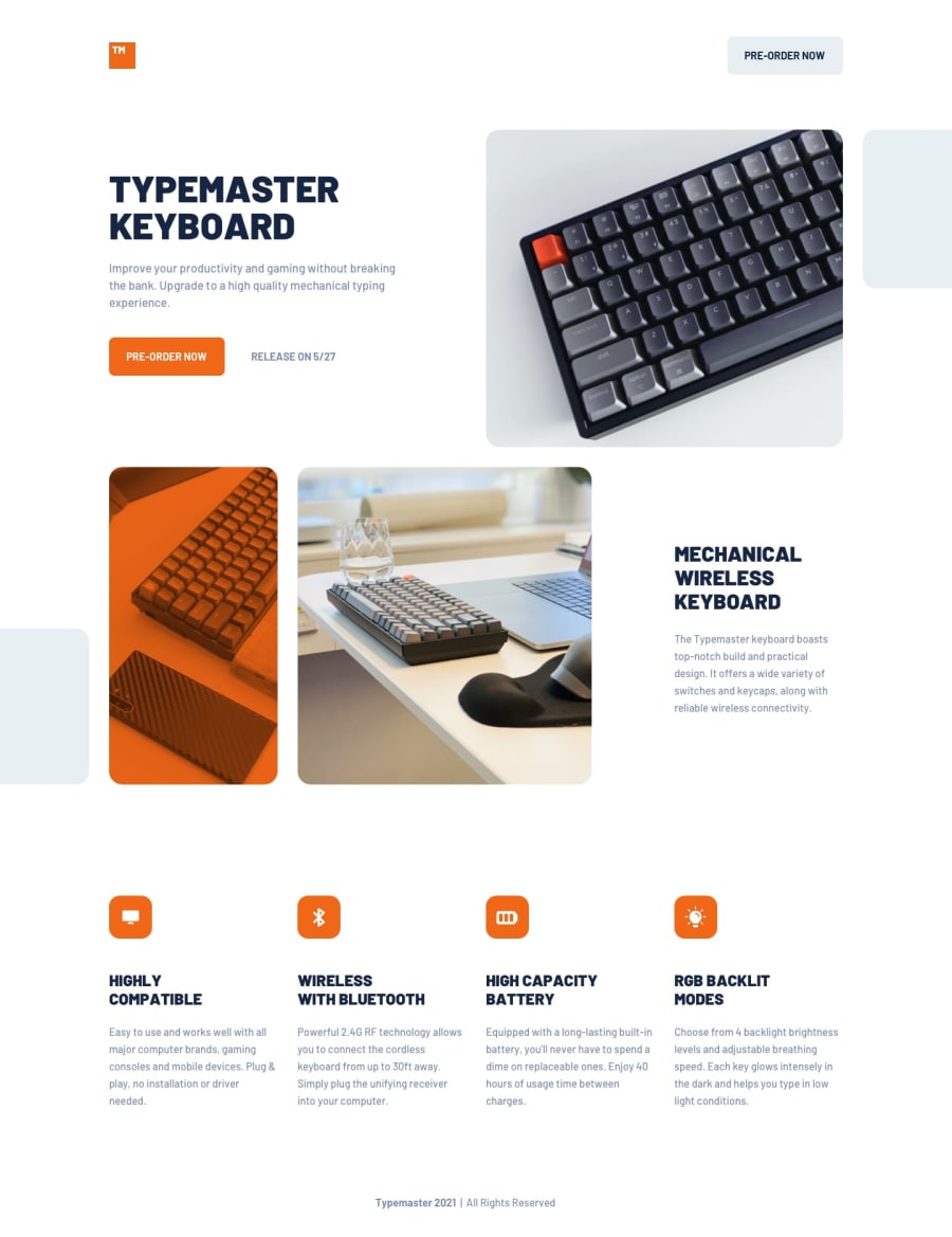
You should not be using min and max width media queries. As a result all I see on this is an unstyled page on mobile. Literally it's like no styling at all. I'll add a screenshot in slack for you to see it
Mobile styles are your base. So all you need to do is have one or more min-width media queries to override specific properties for the larger screen layouts
1@grace-snowPosted about 2 years agoIn the html the main thing you need to improve is alt text on images. Look up how to write good alt text and how to treat decorative images.
Even the logo needs it's alt fixing and that is a very important image - unless this website is called "logo image" and that's what the logo says in text
0@rameshkmunjalPosted about 2 years ago@grace-snow Thanks a lot for your feedback.
0
Please log in to post a comment
Log in with GitHubJoin our Discord community
Join thousands of Frontend Mentor community members taking the challenges, sharing resources, helping each other, and chatting about all things front-end!
Join our Discord
