Typemaster using SCSS and HTML5. Keyboard accessibility
Design comparison
Solution retrospective
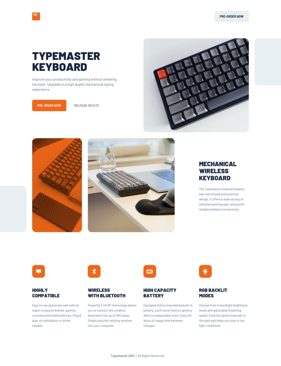
I would like feedback on how accessible my site is for example keyboard users. Also I would like to know how you guys controlled the grey block svgs which I used pseudo classes. Another thing is how anyone moved their image off screen a little bit, I used negative margins for that task which I think isn't the best because I had to use overflow: hidden for the mobile then unset it on bigger screens. If there is any SCSS tips or accessibility tips let me know. :)
Community feedback
- @SkidragonPosted over 3 years ago
One last thing, how did you guys use filter to create the orange overlay on the keyboard image or was it a different property?
0@artveraaPosted over 3 years ago@Skidragon I used a pseudo-class, with reduced opacity, I did not find the right filter
0
Please log in to post a comment
Log in with GitHubJoin our Discord community
Join thousands of Frontend Mentor community members taking the challenges, sharing resources, helping each other, and chatting about all things front-end!
Join our Discord
