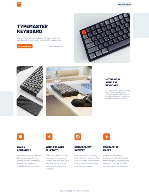
Design comparison
SolutionDesign
Solution retrospective
What specific areas of your project would you like help with?
Hi! Please your support, it seems to me that grid-areas could be improved, I would appreciate any advice, thank you very much!!
Community feedback
- @0xabdulkhaliqPosted 8 months ago
Hello there 👋. Congratulations on successfully completing the challenge! 🎉
- I have a suggestion regarding your code that I believe will be of great interest to you.
IMPROPER USAGE OF HEADINGS ↗️:
- There's a minor semantic issue which is way more crucial and needs to be fixed, that's the usage of
h3
for button like elements "PRE ORDER".
- Actually those elements needs to be a
button
ora
, for this challengea
is more likely to be good (because when the user clicks "PRE ORDER" they must want to go to form where they can preorder the stuff with their credentials)
- And additionally add
cursor: pointer
CSS property fora
elements, it's important for action elements because it changes the cursor from the default arrow to a pointer when hovering over the element. This provides a visual cue to the user that the element is clickable and encourages interaction. It also helps to provide feedback to the user by indicating which elements are clickable and which are not.
- So you want to change the
h3
intoa
element as shown in below,
<a href="#" class="btn text-upper">pre-order now</h3>
- Now your component's
button
has got the pointer & you learned about this property as well
.
I hope you find this helpful 😄 Above all, the solution you submitted is great !
Happy coding!
0
Please log in to post a comment
Log in with GitHubJoin our Discord community
Join thousands of Frontend Mentor community members taking the challenges, sharing resources, helping each other, and chatting about all things front-end!
Join our Discord