Submitted about 4 years agoA solution to the Typemaster pre-launch landing page challenge
Typemaster Responsive Layout
@fraserwat

Solution retrospective
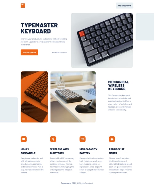
Nice and straightforward, but I couldn't quite get the orange filter on the image after the hero section to match the figma files on this. The darker parts are much more defined on the original. Any suggestions on how to get there v much appreciated!
Also on forcing line breaks on titles in a few places is there a simpler way of doing this than with <span> tags?
Aside from those questions, any tweaks that could have been made v much appreciated!! 😎
Code
Loading...
Please log in to post a comment
Log in with GitHubCommunity feedback
No feedback yet. Be the first to give feedback on Fraser Watt's solution.
Join our Discord community
Join thousands of Frontend Mentor community members taking the challenges, sharing resources, helping each other, and chatting about all things front-end!
Join our Discord