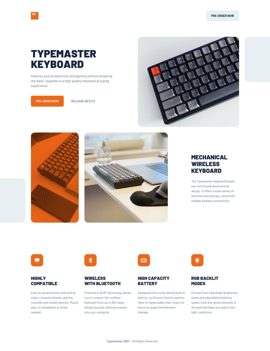
Design comparison
Solution retrospective
Today I finally finished the third project. In this project I made it simple by using Sass, semantic HTML and CSS.
To begin with, I structure first the HTML into three parts such as header, main and footer. In the main part, it is divided into three sections consisting three separate contents. I used Sass to style the UI interface and used the given images as backgrounds instead of assigning it inside the HTML. I came across some issues regarding on the usage of the images which are:
- Making layers on individual images.
- A smooth media query breakpoints.
- The proper usage of Pseudo-classes (if this is applicable)
My solution was to used masked images so I don't have to fixed the positions in every breaks points on media queries.
Any feedback are welcome and Have a good one! Cheers y'all!
Community feedback
- @dwhensonPosted almost 3 years ago
hey @RioCantre top job here!! 🙌 - really not a lot I can say. I like everything you have done!
My only small comment would be to consider limiting the nesting of your SCSS. I try and limit it to 3 levels at most, otherwise I find that I can get in a mess.
This page: https://sass-guidelin.es/ has some nice suggestions on best practices for SCSS organisation and is worth a read.
That's it!! Lovely work - keep it up for the next one!!
Cheers 👋
Dave
Marked as helpful1
Please log in to post a comment
Log in with GitHubJoin our Discord community
Join thousands of Frontend Mentor community members taking the challenges, sharing resources, helping each other, and chatting about all things front-end!
Join our Discord
