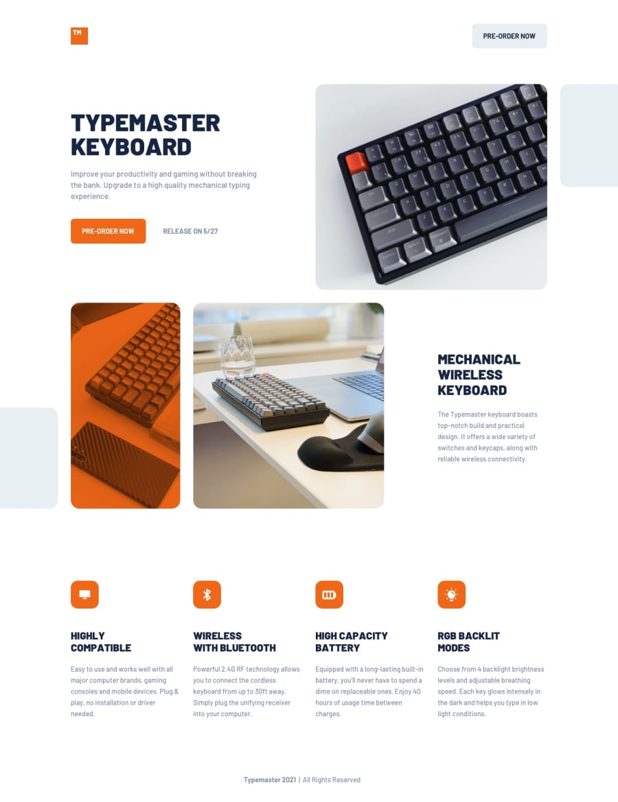
Design comparison
Solution retrospective
Oh my .... This was extrem pain to make. I really recommend this challange to practice GRID. There are still tons of mistakes and page layout differences.
Community feedback
- @ccreusatPosted almost 3 years ago
Hey nice one ! Really close to the design. You can fix your a11y and html issues :)
0@TomasScerbakPosted almost 3 years ago@ccreusat Hi thank you. Can you please elaborate on a11y? Not sure what that is. Where should I put my bg gray images to fix html issue?
0@ccreusatPosted almost 3 years ago@TomasScerbak yeah of course sorry. this is a shortcut for "Accessibility". You can see this in the Report panel (blue panel) above comments (only 2 a11y and 2html issues but it's best practice to fix'em) ;)
0@TomasScerbakPosted almost 3 years ago@ccreusat yes I checked the report but I'm not sure where should I put these 2 images as they mean nothing, they are just for decoration. Also not sure why only section--two and section--three has these HTML errors since I have section--one with no h2-h6 element too and has no issue. But I will try to investigate. Thank you
0@ccreusatPosted almost 3 years ago@TomasScerbak:
- about the images, I think they shouldn't be place here, you should put everything in the <main> tag or use ::before/::after pseudo-element on the right section to display these purely decorative image.
- about your headings, maybe you could generate another report, this is probably a mistake or you changed something since this one.
0
Please log in to post a comment
Log in with GitHubJoin our Discord community
Join thousands of Frontend Mentor community members taking the challenges, sharing resources, helping each other, and chatting about all things front-end!
Join our Discord
