Submitted over 3 years ago
Typemaster pre-launch landing page - HTML&CSS - using flexbox
@chillcodemao
Design comparison
SolutionDesign
Solution retrospective
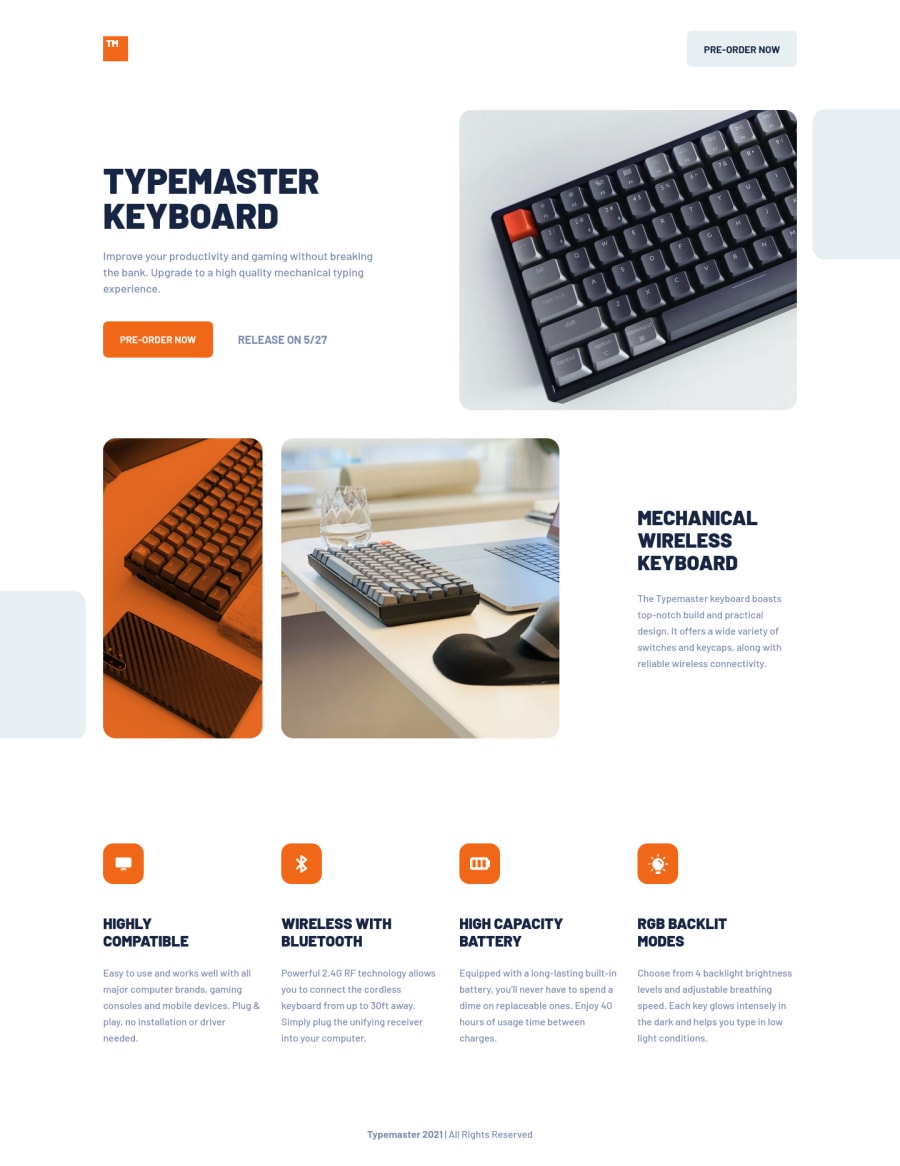
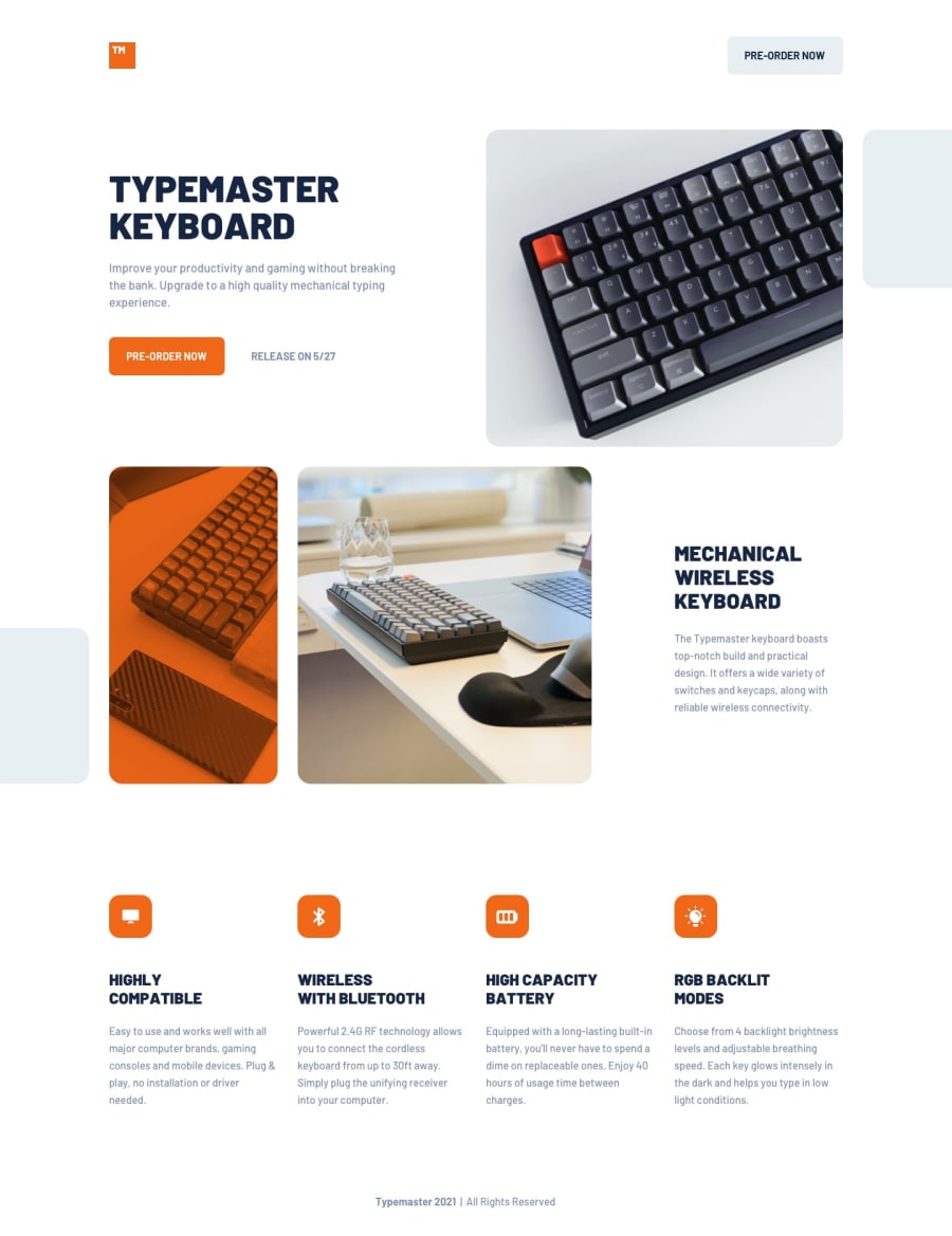
Used background-image for the images and it works but I'm not too happy with the responsiveness between the standard resolutions..
What would be a better approach to positioning the images (including the square image) in order to achieve better responsiveness between mobile-tablet-desktop resolutions?
Community feedback
Please log in to post a comment
Log in with GitHubJoin our Discord community
Join thousands of Frontend Mentor community members taking the challenges, sharing resources, helping each other, and chatting about all things front-end!
Join our Discord
