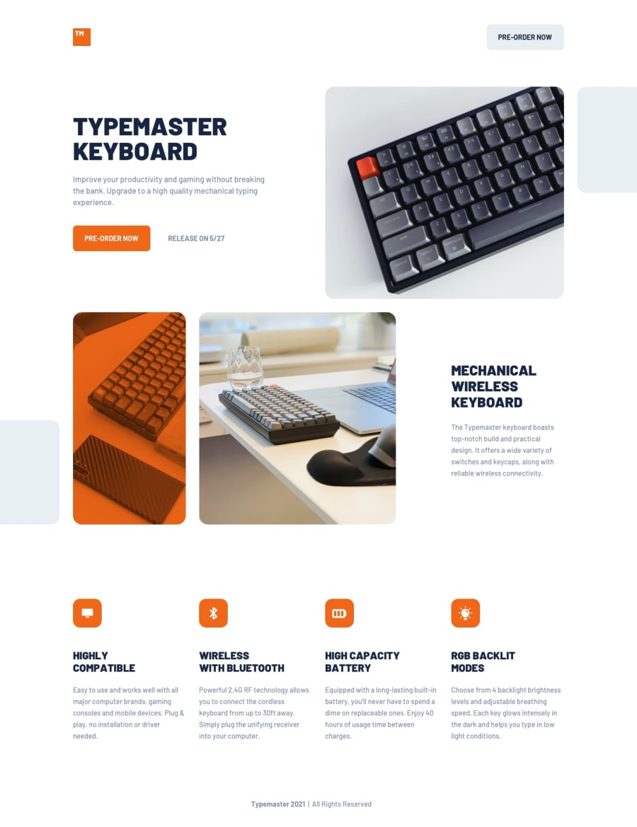
Design comparison
Solution retrospective
I used section landmarks, more as a visual help as I was going through the HTML architecture.
I know it's not a good habit. What would be a good solution ? What is supposed to be "main" in that kind of project ?
I've got an issue between 1024px' and '1200px' (roughly) : the height of a grid is larger (due to a paragraph inside) than images on the other grid areas, making some weird, cut-off images and an orange overflow (used as a "filter"). Also, on the bottom section, it makes h3` go over 3 lines, making everything off.
What would be the good way to understand and fix these issues ?
Thanks so much everyone.
Community feedback
- @grace-snowPosted almost 2 years ago
Hi
Sections are not actually landmarks unless labelled, and 99% of the time they're not needed. They act like divs. It's fine to use them but these should all be inside a
mainI recommend you remove your
.wrapperdiv altogether. You shouldn't ever use huge paddings like that. It is a better practice to have a wrapper class that sets a max-width for the content, a little padding on the sides and a margin auto on the sides. You then use that class wherever it is needed lower down the DOM. At the moment the pseudo elements (e.g. ontop-section) are causing horizontal overflow. That's where instead you'd let that section be 100% wide (edge to edge) but set it's overflow to hidden, then use the wrapper class inside for the main content to be within that wrapper.You are misusing aria-labelledby on the logo. It's pointing to an ID that doesn't exist. It doesn't need this attribute at all as you've already got alt on the image
Set vertical margins on text elements. At some screen sizes text elements are touching each other
Alt does not need to ever say words like "image" or "picture". They are already an image role. Instead they should describe what the image actually looks like
The images in the project-description section need
object-fit: cover; height: 100%;The icons in
product-percsare decorative, so alt should be blank. You should also give these icons a fixed height and width.Marked as helpful1 - @allmtzPosted almost 2 years ago
Hey not sure what the best approach is but here are a couple different ideas for the 'filter' issue
- Set the height of the phone and keyboard image to 100% or
- Wrap the image in a
<div>and thenoverflow:hiddenthe<div>or - Add grid rows and
spanthe image across the rows so it only takes up the space it needs
Let me know if any of these work !
Marked as helpful0
Please log in to post a comment
Log in with GitHubJoin our Discord community
Join thousands of Frontend Mentor community members taking the challenges, sharing resources, helping each other, and chatting about all things front-end!
Join our Discord
