Typemaster Pre-Launch Landing Page - Vanilla CSS

Solution retrospective
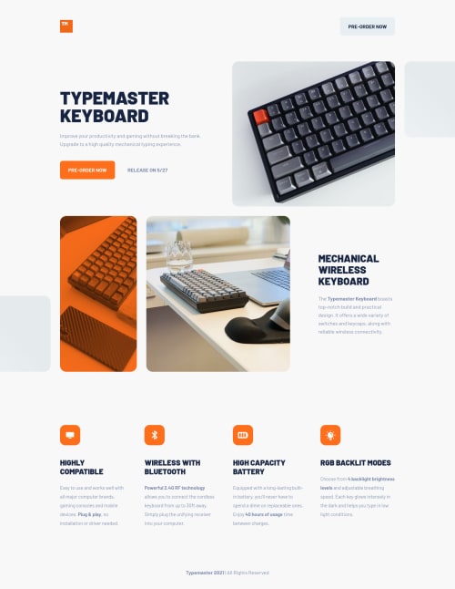
👾 Hello, Frontend Mentor community. This is my solution for the Typemaster Pre-Launch Landing Page
I finally finished all HTML/CSS only challenges (25/25). Now I feel ready to start to study Javascript and CSS frameworks. I had a really great time learning a lots about Vanilla CSS and html structure, flex and grid layouts.
A great challenge to sharp the Grid Layout skills and also work the layout around devices. The two aspects I spent more time was the hero section grid and the decorative pseudo-elements out of the container. Indeed to finish the pseudo-elements I had to ask help to my friend @AdrianoEscarabote that give me a lesson about the overflow property and parent/child elements.
If you can add something or give me some tip. I'll be happy to hear any feedback and advice!
Please log in to post a comment
Log in with GitHubCommunity feedback
No feedback yet. Be the first to give feedback on Lucas 👾's solution.
Join our Discord community
Join thousands of Frontend Mentor community members taking the challenges, sharing resources, helping each other, and chatting about all things front-end!
Join our Discord