Design comparison
SolutionDesign
Solution retrospective
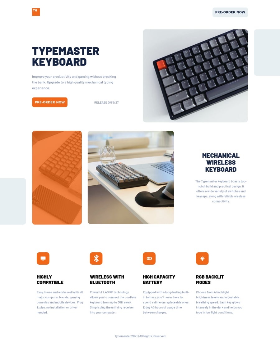
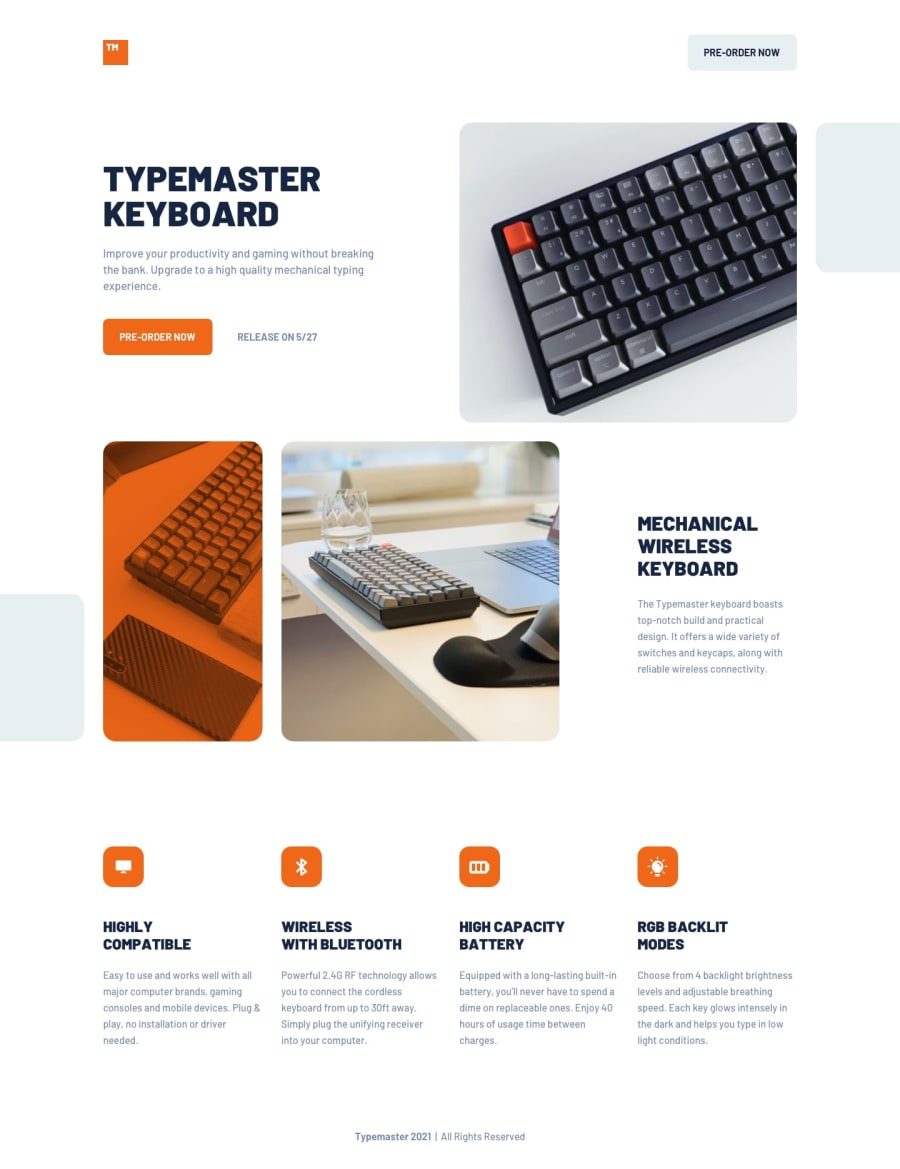
I had a hard time making the image overlay look like the Figma example. If anyone can give me some tips on how to improve it, I would greatly appreciate it.
Aside from that, all other feedback is welcome and encouraged.
Community feedback
Please log in to post a comment
Log in with GitHubJoin our Discord community
Join thousands of Frontend Mentor community members taking the challenges, sharing resources, helping each other, and chatting about all things front-end!
Join our Discord
