Design comparison
Solution retrospective
Any suggestions would be appreciated.
Community feedback
- @anar-solPosted about 3 years ago
Hello!
-
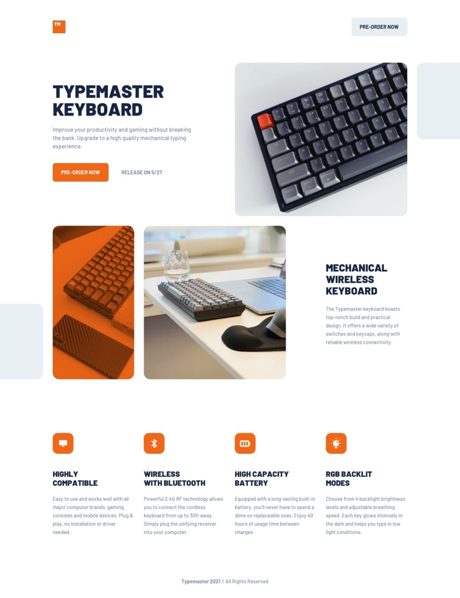
I think there's a problem with small viewports (mobile). The first section content is not displayed due to this rule
.typemaster__content { display: none; } -
You use a translation to make the images appear close to the edge, but because they take more space, it creates a horizontal scrollbar. You can fix that with an
overflow: hiddenon their container. -
It's good to have responsive images, I could be wrong but, isn't it better to make them responsive and respect a certain aspect ratio? At 1024px viewport, for example, the image with keyboard and glass become too long.
I uploaded a solution to this challenge yesterday. Feel free to give me feedback and suggestions =)
Marked as helpful0@ttakeyayaPosted about 3 years ago@anar-sol
Thank you for your suggestions.
I am attempting to fix the points you pointed out. The first two are easily fixed, but the last one...I am still working on it. Like you said, my solution doesn't maintain the aspect ratio of images. I need to learn how to keep the aspect ration for grid items.
Your solution site looks pretty nice!
Add : The problem was that I defined 'grid-template-columns' with fr unit, but used the specific height(32rem) for 'grid-template-rows' so that the aspect ratio of the images couldn't be kept. It's time to refer to your solution :) thanks!
0 -
Please log in to post a comment
Log in with GitHubJoin our Discord community
Join thousands of Frontend Mentor community members taking the challenges, sharing resources, helping each other, and chatting about all things front-end!
Join our Discord
