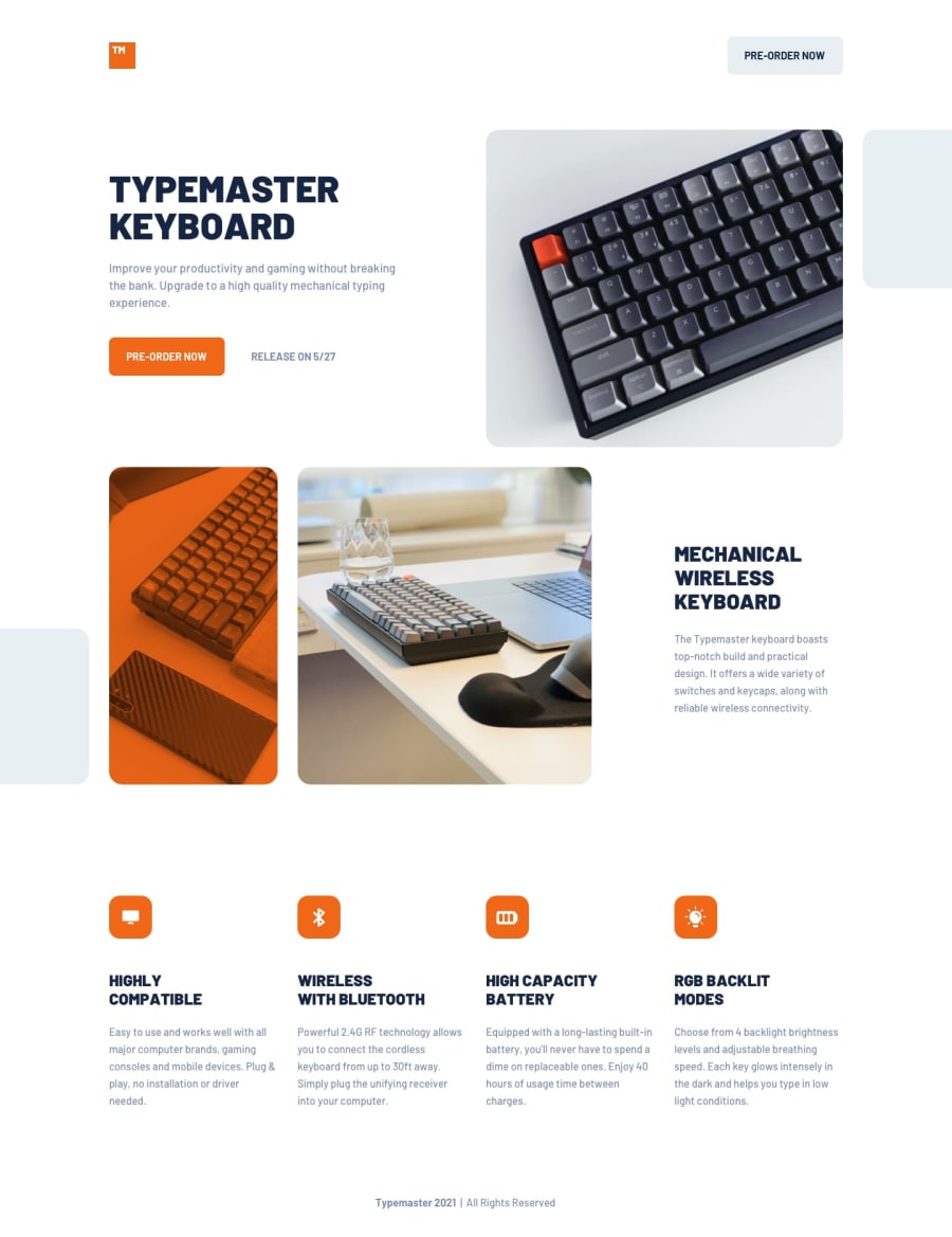
Typemaster pre-launch landing page using React
Design comparison
Solution retrospective
I'm proud because this is the second challenge that used react and I got to create the layout fluid very look like with the challenge. The layout isn't easy. I would plan more before to start the challenge.
What challenges did you encounter, and how did you overcome them?The biggest challenge was create a responsive and fluid layout with several elements in different positions. I tried some different resources to get the result, as flexbox, grid, aspect ratio. But the persistence was important.
What specific areas of your project would you like help with?I would like help about as define the element height, maintaining it responsive.
Community feedback
Please log in to post a comment
Log in with GitHubJoin our Discord community
Join thousands of Frontend Mentor community members taking the challenges, sharing resources, helping each other, and chatting about all things front-end!
Join our Discord
