


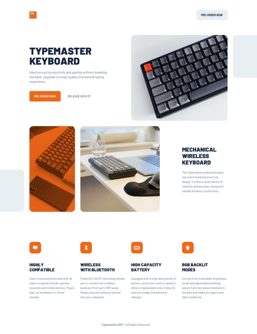
Design comparison
SolutionDesign
Solution retrospective
If you have any feedbacks, I'll take them 🙂
Community feedback
- @RioCantrePosted over 2 years ago
Hello there! Awesome work with this challenge. Looking at your solution, I think you should know the following as well…
- There are possibilities to add more semantic tags. For instance, this line
<div class="header__grid--right">can be wrap withfiguretag and this one<div class="main__title--text">withsection. But everything is looking great and well used of most common semantic tags. - The code is clean and well structured.
- Try viewing around
1116pxviewport, the images in the.main__imgsrule set havejustify-content: space-between;, change it withjustify-content: flex-start;. Since the main header image is transitioning from left to right. - Well use of Sass in styling, specially the compositions
- I think you could try adjusting the Flexbox in
696pxviewport for the.main__title--textrule set and set themain ulrule set withtext-align: center;orjustify-content:center;. If your using mobile first, try adding another breakpoint or increase the size - The details of the design are well implemented based on the original design
Above all, the project is well implemented. Keep up the good work!
Marked as helpful1 - There are possibilities to add more semantic tags. For instance, this line

Please log in to post a comment
Log in with GitHubJoin our Discord community
Join thousands of Frontend Mentor community members taking the challenges, sharing resources, helping each other, and chatting about all things front-end!
Join our Discord