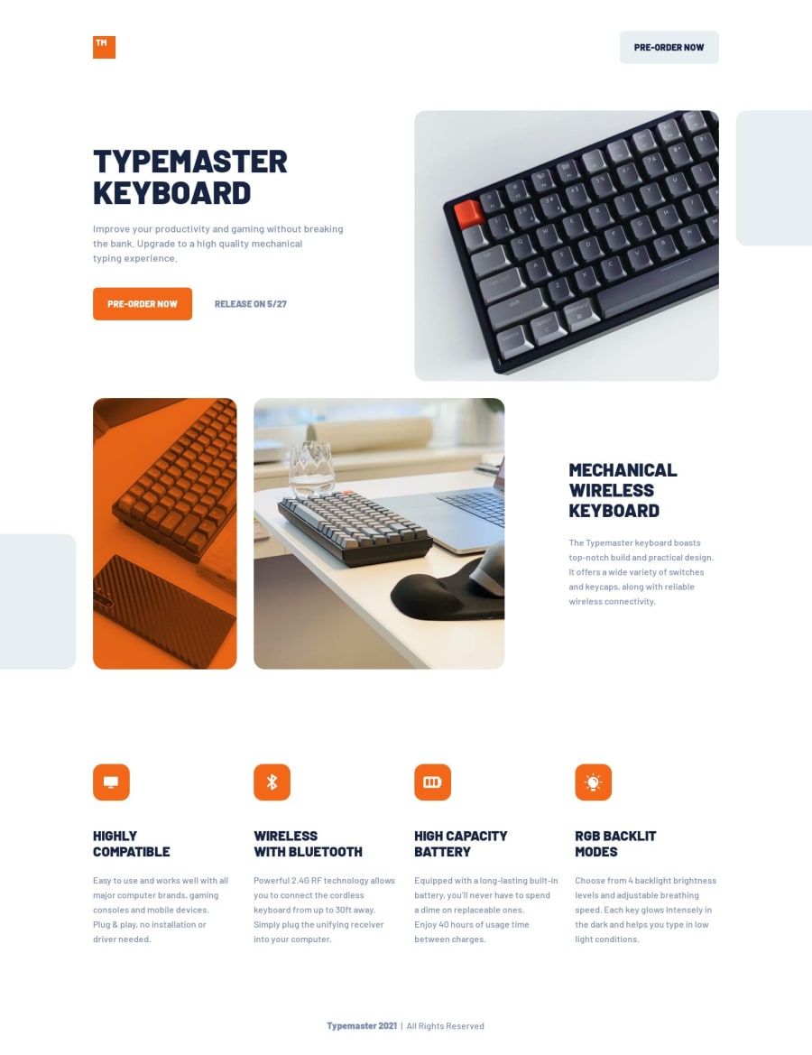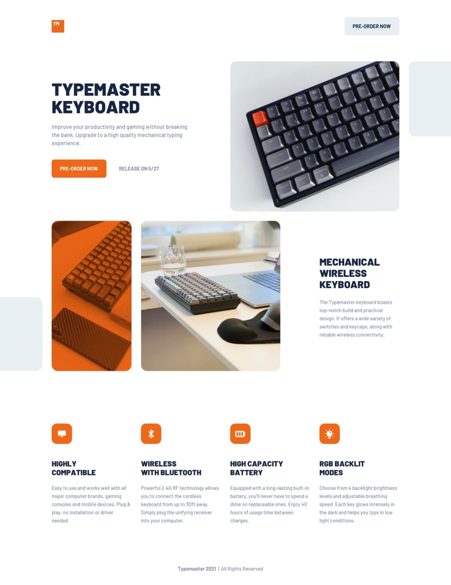
Typemaster landing page with flexbox and grid
Design comparison
Solution retrospective
- proper layout positions
- decor placements
- Feedback is welcome!
Community feedback
- @grace-snowPosted 3 months ago
Really nice looking solution, well done!
The only issues I see in this are
- buttons being used for what should be links.
- an aria-label that's changing the text of a button. That should be removed. It can cause problems for speech control if you change accessible names of controls that already have visible text inside.
- what I already mentioned on discord: make sure text like the release date can wrap onto a new line when there isn't enough horizontal space. Make sure you test down to 320px wide.
Marked as helpful0
Please log in to post a comment
Log in with GitHubJoin our Discord community
Join thousands of Frontend Mentor community members taking the challenges, sharing resources, helping each other, and chatting about all things front-end!
Join our Discord
