Design comparison
Solution retrospective
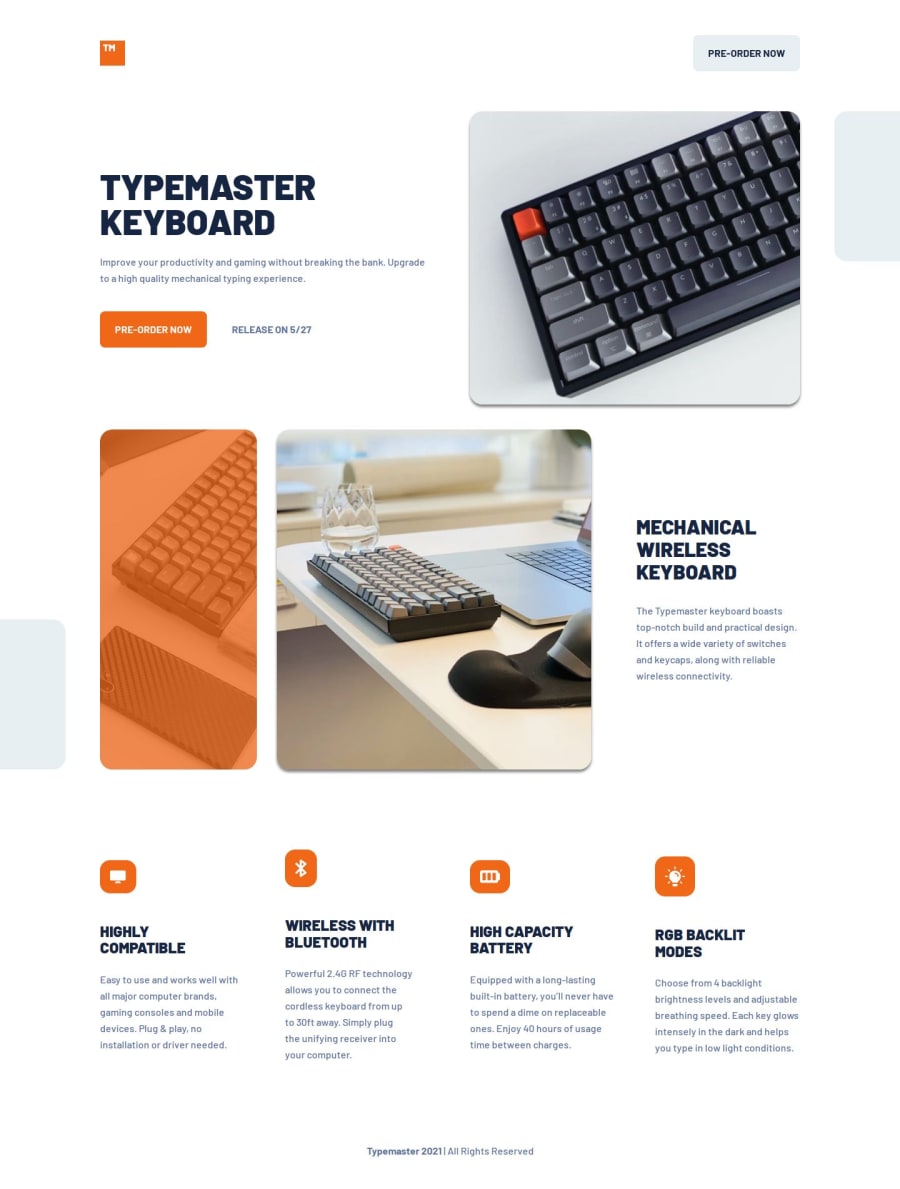
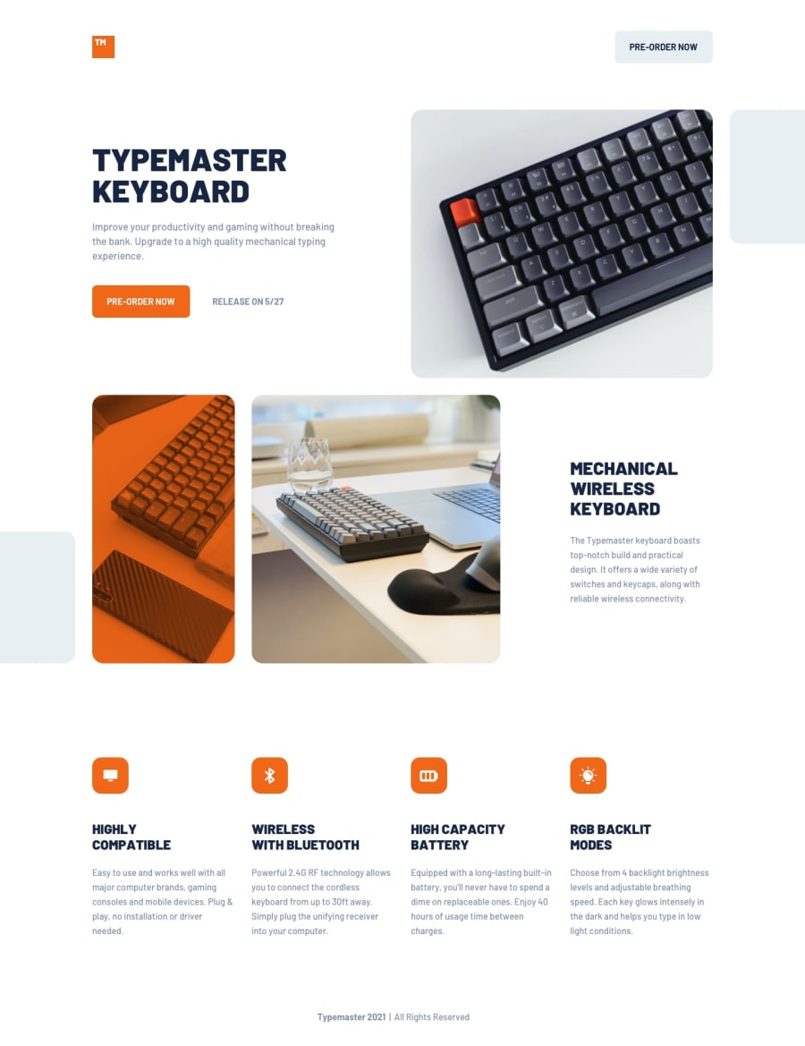
I'm proud of figuring out all the complexities, layout-wise. I'm also happy that I used container queries in practice! I used it on the "mechanical wireless keyboard" section, where I changed the flex-direction from column to row when its wrapper equals 500px or more.
The layout was a bit challenging, with some of the images reaching either the left or right edge. This meant that I had to write a lot of rules for the padding on elements.
I also had to google how to create the dark orange overlay on one of the images.
I'm always open for feedback :)
Community feedback
- @rayaattaPosted 4 months ago
Hey there👋.
The only thing I think needs updating is the pre-order link. Elements that behave as buttons but are built using other tags such as span, div, a or others, should include a role attribute that equals to button just to improve on accessibility. Other than that impressive solution✌️.
1@Islandstone89Posted 4 months ago@rayaatta Thank you for feedback. I see "Pre-order" as a link that would navigate the user to another page, not as a button that triggers an action. So I don't agree it is a element that behaves as a button. If it were, the correct element would be
<button>, instead of settingrole="button"on an element that is not a button.A link styled to look like a button doesn't mean it is a button 🙂
0@rayaattaPosted 3 months agoMy bad, i thought it was meant to be a button but now all is well 😅 @Islandstone89
1
Please log in to post a comment
Log in with GitHubJoin our Discord community
Join thousands of Frontend Mentor community members taking the challenges, sharing resources, helping each other, and chatting about all things front-end!
Join our Discord
