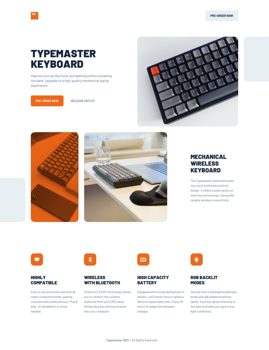
Design comparison
Solution retrospective
For some reason the margins don't look good on Chrome. They're fine on Firefox and Safari.
Community feedback
- @cmcrawford2Posted 11 months ago
Hi, Thanks for the advice! I am setting the box-sizing to border box and the margins to 0, but not the padding. I think the problem is that I've been using padding-inline: 2.5rem to set all my left-right margins. This is the same as padding 0 2.5rem or padding-left 2.5rem and padding-right 2.5rem. I don't think Chrome supports it. I could have set the padding on the body and have left it at that, then just changed it for tablet and desktop. Cris
0 - @danielmrz-devPosted 11 months ago
Hello, Cris!
Your project looks great!
I have a suggestions about the margin issue that you're having:
- You can use a CSS reset. This is a setting that includes some CSS rules with sensible declarations for reducing browsers inconsistencies.
I use a very simple one:
* {
    margin: 0;
    padding: 0;
    box-sizing: border-box;
}
There are other ways to do this, with many more rules. But for me, at least for now, this one has been enough.
I hope it helps!
0
Please log in to post a comment
Log in with GitHubJoin our Discord community
Join thousands of Frontend Mentor community members taking the challenges, sharing resources, helping each other, and chatting about all things front-end!
Join our Discord
