Design comparison
Solution retrospective
I am very proud of the overall appearance of the project. It turned out pretty well and looks good. Next time I will try and do better job at the structuring of the project with HTML as I feel like I had to "hack" a couple of times.
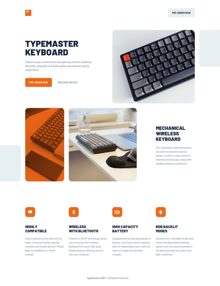
What challenges did you encounter, and how did you overcome them?A challenge I encountered was the positioning of the images. It was quite tricky for me as the setup was different depending on the screen. I overcame the challenge by using grids and using CSS to display the div depending on the screen.
What specific areas of your project would you like help with?I would like help with the positioning of the images. I am sure there's a better and more efficient way of positioning the images.
Community feedback
Please log in to post a comment
Log in with GitHubJoin our Discord community
Join thousands of Frontend Mentor community members taking the challenges, sharing resources, helping each other, and chatting about all things front-end!
Join our Discord
