Design comparison
Solution retrospective
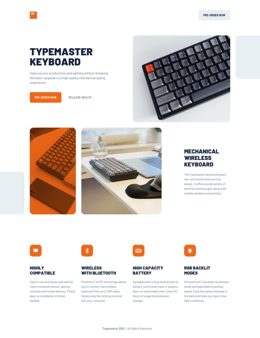
Hello! I was able to make a responsive implementation, however, I think that the layout between 375px to 768px looks a bit awkward. Any tips to make it look a little bit nicer? I appreciate all feedback!
Community feedback
- @ApplePieGiraffePosted over 3 years ago
Greetings, Franco A! 👋
Good work on this challenge! 🙌 Your solution looks nice and responds quite well! 👍
One or two things I'd like to suggest are,
- Adding
overflow-x: hiddento thebody(or something similar) to prevent a horizontal scroll bar from appearing along the bottom of the page in the desktop layout of the site. - Adding
object-fit: coverto the some of the images of the site to ensure that they are clipped (not stretched or squeezed) when the size of the screen changes. 😉
Keep coding (and happy coding, too)! 😁
1 - Adding
- @palgrammingPosted over 3 years ago
well you should look at your first Keyboard image on the page cause in that range of width that you said it awkward you do not have the placement were the design file is showing. part of the image is tucked under the right side of the browser in the design file. And since you are a pro-account you should check out the design file
if you are on windows you can use Lunacy for free to open the sketch files https://icons8.com/lunacy
1
Please log in to post a comment
Log in with GitHubJoin our Discord community
Join thousands of Frontend Mentor community members taking the challenges, sharing resources, helping each other, and chatting about all things front-end!
Join our Discord
