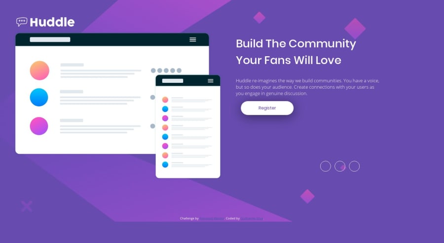
Trying Mobile first web development with html and css
Design comparison
Solution retrospective
Hi everyone, it's me again ;D
Well, I don't know why it broke so much in the desktop version, i figure out maybe the size of screen doesn't match. Any thoughts?
Community feedback
- @mattstuddertPosted almost 5 years ago
Nice work, Guilherme! You've done a really good job on this challenge. The small differences on desktop are just down to small spacing tweaks that would be needed. Overall though the layout looks good. One thing you could add is
background-size: cover;to the background image so that it stretches the full width of the screen, especially on mobile.Keep up the great work!
1@silva-guilhermePosted almost 5 years ago@mattstuddert Thanks for the feedback Matt! How great tip, i want to improve my skills every day and i will keep this golden tip to be better and come back with more beautiful and better layouts.
1@mattstuddertPosted almost 5 years ago@silva-guilherme you're welcome! I'm happy to help 🙂
0
Please log in to post a comment
Log in with GitHubJoin our Discord community
Join thousands of Frontend Mentor community members taking the challenges, sharing resources, helping each other, and chatting about all things front-end!
Join our Discord
