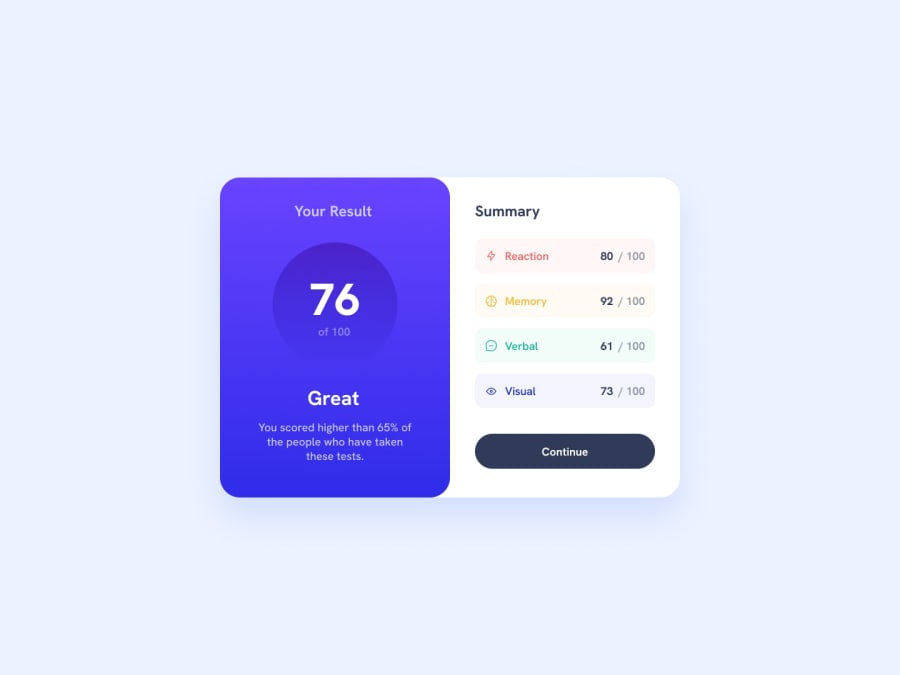
Design comparison
Solution retrospective
I found it difficult to get rid of the white bit on the left of the container.
I found it really useful to stop and think about the html first.
What challenges did you encounter, and how did you overcome them?Choosing the layout mode, especially for centering.
What specific areas of your project would you like help with?I realise I haven't copied the spacing perfectly. I'm just wondering how to remove the white bits from the container (on the top and bottom left, to the outside of the blue card).
Community feedback
- P@kodan96Posted 10 months ago
hi there!
you can have mixed
border-radiuson your elements, this property accepts up to 4 values. When giving it four it starts from the top left corner going clockwise. so your property should look something like this:border-radius: 10px 0 0 10px;also you can center your content with Flexbox if you apply these to the
bodytag:body { min-height: 100vh; display: flex; justify-content: center; align-items: center; }note that if you wanna do the same for bigger projects that has more elements you should also apply
flex-direction: column;to the same tagHope this was helpful 🙏
Good luck and happy coding! 🙌
Marked as helpful2P@innitmanPosted 9 months agothank you so much, really appreciate your effort and example code :)
@kodan96
0
Please log in to post a comment
Log in with GitHubJoin our Discord community
Join thousands of Frontend Mentor community members taking the challenges, sharing resources, helping each other, and chatting about all things front-end!
Join our Discord
