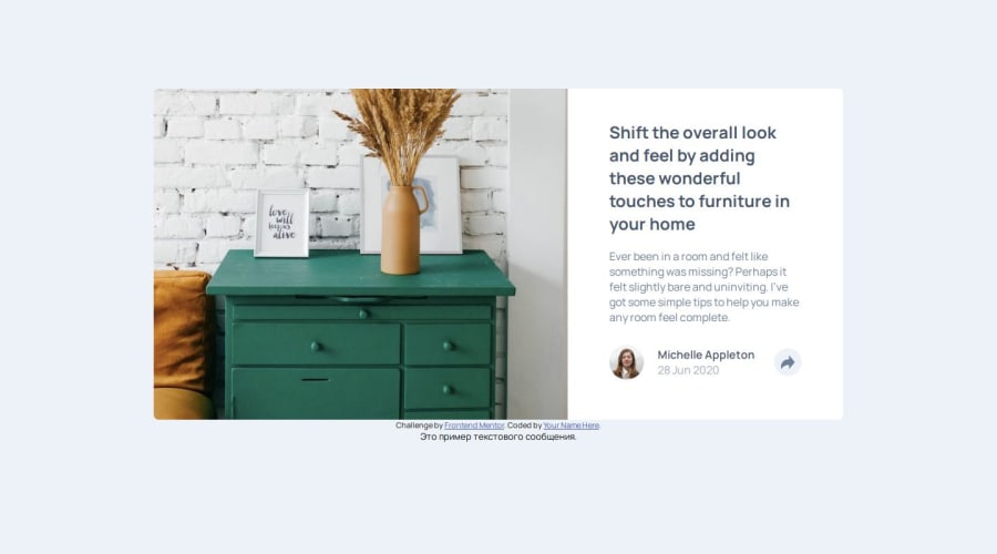
Design comparison
SolutionDesign
Community feedback
- @IbrahimMuradPosted 2 months ago
Issues I noticed:
- The article title is wrapped with an open tag of
h2and close tag ofh3. - S H A R E shouldn't be written with spaces between each character, you should use CSS to handle this:
.popup_text {
    font-variant-caps: all-petite-caps;
    letter-spacing: 0.5rem;
}
the first property ensures all the characters are uppercase and the second one defines the spaces between the letters.
- normally you use dashes instead of underscores in naming in HTML and CSS.
Things to consider
- use variables to define values that you will use multiple times in your stylesheet, this will reduce redundancy and increase readability.
- you could use different
topandleftvalues for larger screens by redefining them in media query, that would put the popup container in the right place, and remember you can use negative values to go beyond the limitations of the container. - you could use the same arrow-link for both activating and deactivating the popup, by using
z-indexproperty. - If you don't know, an image can be cropped to fit a certain width and height using
object-fit: cover.
Overall, nice work. And keep up.
Marked as helpful0 - The article title is wrapped with an open tag of
Please log in to post a comment
Log in with GitHubJoin our Discord community
Join thousands of Frontend Mentor community members taking the challenges, sharing resources, helping each other, and chatting about all things front-end!
Join our Discord
